You need visual weight in pottery to create a sense of balance and emotional impact that symmetry alone can’t achieve. Surface texture, color contrast, and placement influence how viewers perceive heaviness or lightness, guiding their eye and making the piece feel grounded or dynamic. These elements help you express mood and stability beyond just the shape. By understanding how to skillfully combine these aspects, you’ll discover how to craft more compelling and expressive pottery—more than just symmetrical forms.
Key Takeaways
- Visual weight creates a sense of stability and groundedness beyond mere symmetry.
- Surface texture and color contrast influence perceived weight, enhancing overall balance.
- Symmetry alone can appear static; adding visual weight introduces dynamic interest.
- Combining surface detail and color helps convey emotional depth and artistic expression.
- Achieving visual weight ensures a harmonious and engaging composition in pottery design.
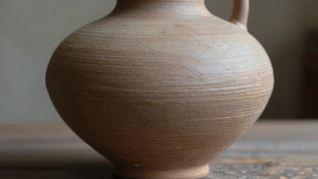
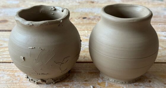
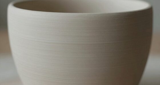
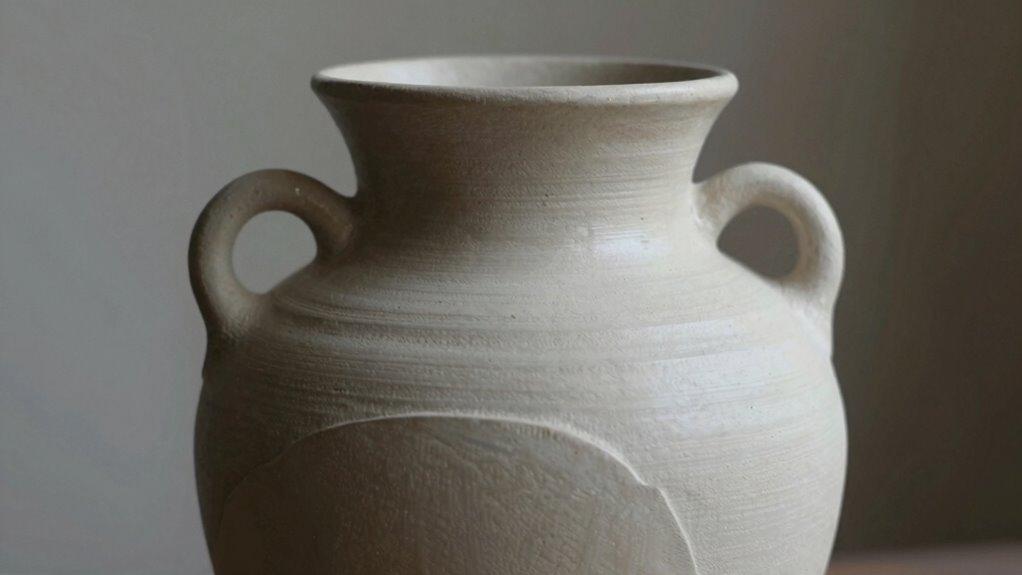
Understanding how pottery forms influence visual weight is essential for creating balanced and compelling ceramic pieces. Visual weight isn’t just about size or symmetry; it’s about how different elements, like surface texture and color contrast, work together to guide the viewer’s eye and create a sense of harmony. When you shape your pottery, you need to contemplate not only its form but how surface details and color choices affect its overall visual impact. A piece with a smooth, glossy surface might appear lighter and more delicate, while one with a rough, textured surface can seem heavier and more substantial. This contrast in surface texture influences how viewers perceive the weight of your piece, making it feel balanced or intentionally unbalanced for artistic effect. Recognizing how visual perception impacts viewer experience helps you craft pottery that communicates depth and intention. Color contrast plays a similar role. Bright, vibrant colors tend to draw attention and can make a form feel heavier visually, especially if they’re placed strategically. For example, applying bold hues at the top of a vessel can create a sense of visual heaviness, anchoring the eye and giving the piece a grounded quality. Conversely, softer or muted tones can make a piece feel lighter, especially if paired with a textured surface that breaks up the visual weight. When you combine surface texture with color contrast, you craft a more nuanced experience. A matte finish paired with subdued colors can suggest subtle weight, while a glossy surface with contrasting colors can generate a dynamic, lively presence. It’s tempting to think that symmetry alone guarantees a balanced look, but true visual weight comes from the deliberate interplay of these elements. A symmetrical form can be visually heavy or light depending on how you incorporate surface texture and color contrast. For instance, a symmetrical bowl with a textured exterior and a contrasting glaze can feel more grounded than a smooth, monochrome one. You want your pottery to have a sense of stability, but also to maintain visual interest. This balance is achieved by carefully contemplating how surface texture adds tactile weight and how color contrast emphasizes or diminishes certain areas of the piece. Additionally, understanding the concept of visual balance allows you to create more harmonious compositions in your work. Recognizing the importance of artistic expression encourages you to experiment with these elements to convey mood and meaning. Incorporating design principles into your practice can elevate your work from functional to expressive art. Symmetry is a foundation, but surface texture and color contrast are what add depth and complexity. When you harness these elements effectively, your ceramic pieces become not just objects of utility but also compelling works of art that draw viewers in, inviting them to explore the subtle interplay of form, texture, and color. A thoughtful consideration of visual weight can truly transform the perception and emotional impact of your pottery.
As an affiliate, we earn on qualifying purchases.
Frequently Asked Questions
How Does Visual Weight Affect the Functionality of Pottery?
Visual weight influences your pottery’s functionality by making it more stable and easier to handle. When you incorporate color contrast and texture variation, the form feels grounded and balanced, preventing it from tipping over easily. These elements guide the eye and enhance grip, ensuring your piece is not only visually appealing but also practical. By balancing visual weight, you improve both the aesthetic and usability of your pottery.
Can Asymmetrical Pottery Be Visually Balanced?
Yes, asymmetrical pottery can be visually balanced. You achieve this by thoughtfully combining color contrast and texture variation, which draw the eye evenly across the piece. By subtly shifting these elements, you create a sense of harmony and stability, even in asymmetry. This approach invites viewers to appreciate the artistry and craftsmanship, making your pottery feel lively and intriguing while maintaining a balanced, cohesive appearance.
What Tools Help Assess Visual Weight in Pottery Design?
You can use tools like visual sketches and 3D models to assess visual weight in your pottery design. Pay attention to color harmony, ensuring the colors guide the eye and create balance. Incorporate texture contrast, which adds depth and weight perception. Step back and view your piece from different angles, adjusting elements until the visual weight feels balanced, even if the form isn’t perfectly symmetrical.
Does Cultural Context Influence Perceived Visual Weight?
Yes, cultural context influences how you perceive visual weight in pottery. Cultural symbolism shapes your artistic interpretation, making certain forms or elements feel heavier or lighter based on tradition or meaning. For example, a shape seen as balanced in one culture might evoke strength or fragility in another. Understanding these cultural nuances helps you create pottery that resonates more deeply, aligning visual weight with the intended message or symbolism.
How Does Lighting Impact the Perception of Visual Weight?
Lighting markedly impacts how you perceive visual weight in pottery. When you use strong light contrast, it highlights the form’s curves and edges, making it feel more substantial. Shadow play adds depth, emphasizing the pottery’s volume and giving it a sense of presence. Gentle lighting can soften these effects, reducing perceived weight, while dramatic lighting enhances it. By controlling light contrast and shadow play, you can guide viewers’ perception of your pottery’s visual weight.
As an affiliate, we earn on qualifying purchases.
Conclusion
Remember, your pottery is more than just shapes and symmetry—it’s a vessel carrying stories and emotions. Visual weight acts like a heartbeat, giving your piece life and presence. Think of it as the soul that balances beauty with strength, drawing viewers in and grounding their gaze. When you craft with intention, your pottery becomes a symbol of harmony—where form and meaning dance together, inviting others to feel the weight of your artistry.
pottery balance and visual weight
As an affiliate, we earn on qualifying purchases.
As an affiliate, we earn on qualifying purchases.
ceramic sculpture balancing weights
As an affiliate, we earn on qualifying purchases.
As an affiliate, we earn on qualifying purchases.