Poor craft lighting often causes colors to look wrong or inconsistent. Using the wrong color temperature, like overly warm or cool lights, can distort how your materials appear, making whites dull or reds muted. Improper light positioning can cast shadows or create glare, obscuring details and misjudging shades. Ensuring balanced, daylight-mimicking lighting with proper placement helps reveal true colors and textures. Keep exploring to learn how to avoid these common mistakes and improve your craft projects.
Key Takeaways
- Using incorrect color temperature lighting (warm or cool) can distort true material colors.
- Poor light placement, such as shadows or glare, can obscure or alter color perception.
- Insufficient or uneven lighting causes color mismatches and reduces visibility of details.
- Relying on ambient light instead of adjustable task lighting can lead to inaccurate color judgments.
- Ignoring the importance of natural daylight or proper color-balanced bulbs results in dull or muted colors.
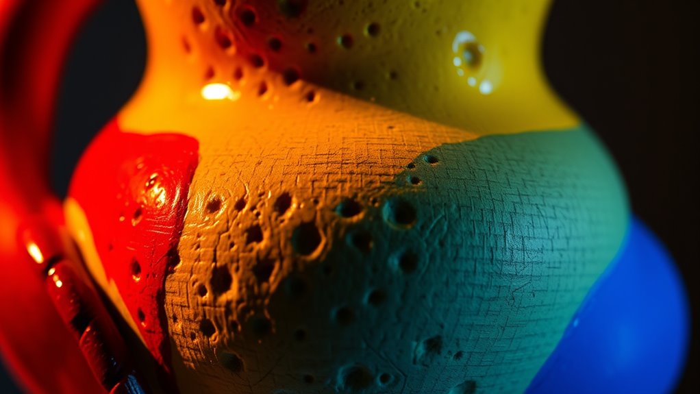
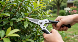
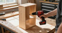
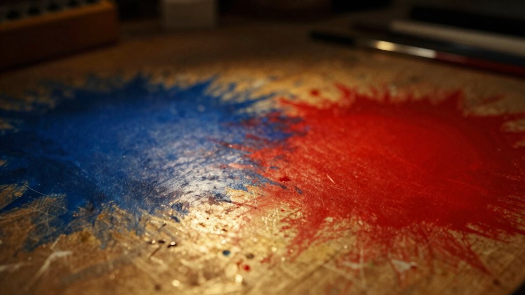
Lighting plays a essential role in crafting a welcoming and functional space, but many crafters make simple mistakes that can hinder their projects. One common error is ignoring the importance of color temperature. When you choose lighting with a color temperature that doesn’t match your workspace, it can distort the true colors of your materials. For example, using overly warm lights (around 2700K) can cast a yellowish hue that makes whites appear dull and colors look warmer than they really are. Conversely, cool white lights (around 5000K or higher) tend to give a bluish tint, which can make reds and yellows look muted or off. To guarantee your crafts look true to life, you need to select lighting with a color temperature that aligns with your project’s needs. Daylight-balanced bulbs (around 5000K) are often ideal because they mimic natural sunlight and help reveal the authentic shades of your materials.
Another mistake that many crafters overlook is light direction. The way you position your lights can dramatically affect how colors appear and how well you see details. If your light source comes from directly above or behind your work, it can create shadows that obscure important details or cause glare that makes it harder to judge colors accurately. Instead, you should aim for a well-placed light source that illuminates your work evenly from the side or at a slight angle. This reduces shadows and helps you see the true colors and textures of your materials. For tasks that require precision, like sewing or painting, adjustable task lights are a game-changer—they let you position the light exactly where you need it. Additionally, avoid casting shadows with your light source; this can cause you to misinterpret colors or miss subtle details.
Together, these two factors—color temperature and light direction—play a essential role in how your craft projects turn out. When you select the right color temperature, your materials’ colors will look natural and vibrant. Proper light placement ensures you see those colors accurately and can work comfortably without straining your eyes or misjudging shades. Neglecting these aspects can lead to projects that look mismatched or poorly finished, simply because the lighting isn’t doing its job. So, take the time to choose the right bulbs and position your lights thoughtfully. It’s a small adjustment that can make a big difference in the outcome of your crafts, helping you achieve professional-looking results every time.

Daylight Company Smart Go Portable Lamp, Ideal for Reading, Light Therapy, Everyday Tasks, Crafts, Desk Work, DIY, Led, Chargeable lamp, 95+ CRI, 1 Count (Pack of 1), White
"PERFECT PORTABLE LAMP: Daylight's portable lamp for active lifestyles and compact spaces, offering versatile lighting solutions."
As an affiliate, we earn on qualifying purchases.
As an affiliate, we earn on qualifying purchases.
Frequently Asked Questions
How Can I Test for Color Accuracy in My Craft Lighting?
To verify for color accuracy in your craft lighting, start with color calibration tools like a color checker to compare how colors appear under your lights. Use light diffusion to soften harsh shadows and ensure even color distribution. Regularly check your lighting setup, adjusting as needed, and compare your work to known color standards. This process helps you maintain consistent, true-to-life colors in your craft projects.
What Are the Best Bulbs for True Color Depiction?
You should choose bulbs with high color rendering index (CRI), ideally 90 or above, for true color depiction. LED bulbs with a balanced spectrum provide excellent color accuracy. When comparing bulbs, look at their CRI ratings and color temperature; daylight-balanced bulbs (around 5000K) often give the most accurate colors. Doing a bulb comparison helps you find the best option for consistent, true-to-life colors in your craft projects.
How Does Natural Light Affect Craft Project Colors?
Natural light acts like a chameleon, shifting throughout the day and affecting your project’s colors. Its color temperature varies, making colors appear warmer or cooler, unlike consistent artificial lighting. When you work in natural light, you get a true sense of your colors, but it can also distort them as the daylight changes. To guarantee accurate colors, consider using artificial lighting with a high color rendering index (CRI) that mimics natural light.
Can Dim Lighting Distort Perceived Colors?
Yes, dim lighting can distort perceived colors because it affects the color temperature and light quality. When lighting is too low, your eyes struggle to distinguish subtle color differences, making everything look dull or off. Poor light quality can also cause color shifts, especially if the light source has a warm or cool tint. To see true colors, confirm your workspace is well-lit with balanced, high-quality lighting that maintains consistent color temperature.
Are There Specific Color Temperature Recommendations for Crafts?
Imagine your workspace bathed in a gentle, warm glow that brings your craft to life—this is where color temperature matters. For crafts, aim for a color temperature between 5000K and 6500K in your craft lighting. This range mimics natural daylight, helping colors appear true and vibrant. Picking the right color temperature guarantees your projects look as stunning in person as they do in your imagination.

Lepro LED Desk Lamp, Metal Desk Light 9.5W 800lm, Best Task Lamp, 5 Color Modes 5 Brightness Level, Dimmable Home Office Desktop Lamp for Reading, Crafting, Sewing, Puzzle, Nail, White
[Multiple Lighting Choices] – This LED desktop lamp offers 5 lighting modes, each of which can be paired…
As an affiliate, we earn on qualifying purchases.
As an affiliate, we earn on qualifying purchases.
Conclusion
So, next time you’re working on your craft lighting, remember that small mistakes can unexpectedly skew your colors, making your project look off. Sometimes, the tiniest oversight—like a mismatched bulb or poor placement—can turn into a surprising challenge you weren’t prepared for. It’s funny how these little coincidences remind us to double-check every detail, ensuring your colors stay true and your craft shines just as you envision it.
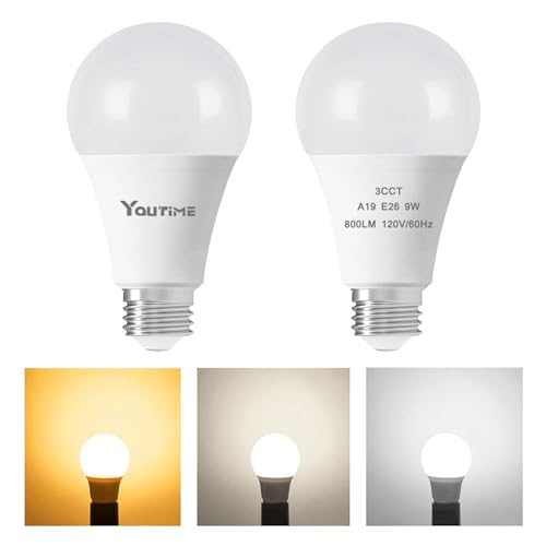
Youtime LED Light Bulb A19 3 Color Temperature 3000K-5000K-4000K,3CCT Color Changing Light Bulbs,Energy Saving 9W(60W Equivalent) LED Bulb,810LM for Bedroom,Living Room,2 Pack
【3 Color Light Bulb】This light bulb can easily adjust three color temperatures through a switch. Buying one 3-color…
As an affiliate, we earn on qualifying purchases.
As an affiliate, we earn on qualifying purchases.

VIISAN DL16 Book Scanner, A3 Overhead Document Scanner with 16MP Camera, 300 DPI, OCR, Auto Page Flattening, Anti-Glare LED Lighting for Books, Archives, Artwork and Large Documents, Windows/Mac
A3 Overhead Scanning for Books and Large Documents The VIISAN DL16 is an A3 overhead book scanner designed…
As an affiliate, we earn on qualifying purchases.
As an affiliate, we earn on qualifying purchases.