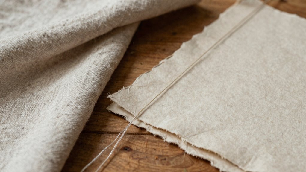

To create a cohesive feel among book cloth, paper, and thread, start by choosing materials with compatible textures, hues, and sheen. Coordinate colors so they complement each other, and consider matching thread to your overall palette for harmony. Select binding techniques that highlight or conceal thread, depending on your desired aesthetic. Play with textures to add tactile interest, and test combinations beforehand for balanced visual and structural integration. Keep exploring how these elements can work together seamlessly.

Get business pricing on tools and workshop supplies
- Business-only prices and quantity discounts
- Tax-exempt purchasing
- Multiple users, one account, clear invoices
Key Takeaways
- Select materials in complementary colors and textures to create visual harmony and cohesive appearance.
- Match thread color and style to the overall palette and material textures for seamless integration.
- Use binding techniques that highlight material interactions, such as decorative sewn signatures or hidden stitching.
- Test combinations beforehand to ensure textures and hues work well together before final assembly.
- Balance tactile and visual elements to emphasize material strengths and create a unified, durable design.

Understanding how book cloth, paper, and thread work together is vital for creating durable and aesthetically pleasing bindings. When you aim for cohesion, you need to take into account how each material interacts visually and structurally. The key lies in mastering binding techniques that emphasize harmony, especially through thoughtful color coordination. By carefully selecting materials that complement each other, you create a unified appearance that enhances the book’s overall appeal. Your choice of binding techniques—such as case binding or sewn signatures—can influence how well these materials integrate. For instance, using a sewn binding allows the thread to be a visible, decorative element, so matching thread color with the book cloth or paper can reinforce the design. Alternatively, hiding the thread creates a clean, seamless look, but even then, selecting a thread that subtly complements your cover materials guarantees cohesion.
Considering the interplay of textures can also elevate the overall cohesiveness of your design, adding tactile interest that draws the viewer in. Color coordination plays a vital role in making these materials feel like parts of a single design. You might choose a book cloth with a subtle texture and pick a paper that shares similar tones or hues. For example, a muted blue cloth pairs well with cream or light gray paper, creating a calm, unified aesthetic. If you prefer bold contrasts, select colors that complement each other on the color wheel—such as deep green with warm orange accents—so the materials stand out while still feeling connected. When you’re working with thread, its color should echo the palette established by the cloth and paper. A contrasting thread can add a decorative touch, but guarantee it doesn’t clash or disrupt the overall harmony. Instead, opt for threads in shades close to your cover materials for a subtle, cohesive effect.
In practice, balancing these elements requires attention to detail. When binding, pay close attention to the texture, thickness, and sheen of each material. Test different combinations beforehand to see how they look together once assembled. Use your knowledge of binding techniques to highlight the materials’ strengths—such as a decorative stitching pattern that emphasizes the thread’s color or a cover material that’s textured enough to add tactile interest. Ultimately, your goal is to make the book feel like a complete piece rather than a collection of separate parts. When you focus on thoughtful material selection, skillful binding techniques, and precise color coordination, you’ll create a book that’s both durable and visually cohesive.
As an affiliate, we earn on qualifying purchases.
Frequently Asked Questions
How Do Color Schemes Impact the Cohesion of Book Materials?
Color schemes greatly impact the cohesion of your book materials by creating harmony or contrast. Using color harmony, you guarantee the book cloth, paper, and thread work together seamlessly, giving a unified look. Incorporate visual contrast thoughtfully to highlight key elements without disrupting this harmony. When you balance these elements, your materials look intentional and cohesive, making the overall design more appealing and professional.
What Textures Work Best for Combining Different Book Components?
You should choose surface textures that complement each other through tactile variety. Smooth, matte finishes work well with rough, textured surfaces to create visual interest without clashing. Incorporate subtle embossed patterns or soft fabric-like textures alongside sleek paper or sturdy book cloth. This contrast enhances cohesion by adding depth and variety, making each component feel intentionally paired and harmonious, inviting touch and engagement without overwhelming the overall design.
How Can I Balance Durability With Aesthetic Appeal in Book Materials?
To balance durability with aesthetic appeal, choose materials with good material longevity that also complement each other’s visual harmony. Use sturdy yet attractive book cloth and thread that resist wear, while selecting paper with a pleasing texture and color. Reinforce critical areas subtly and consider sealing or finishing surfaces for added durability without sacrificing style. This approach guarantees your book remains both beautiful and resilient over time.
Are There Specific Adhesives Recommended for Different Materials?
You should choose adhesives based on their compatibility with each material. For book cloth, PVA glue works well because of its flexibility and strong bond, while starch-based adhesives suit paper for a gentle adherence. For thread, use a strong, quick-drying glue like epoxy or specialized bookbinding glue. Always consider adhesive compatibility and drying times; faster drying adhesives streamline your process, but guarantee they won’t compromise the materials’ integrity or aesthetics.
How Do I Choose the Right Weight for Paper and Thread?
Imagine holding a delicate leaf against rough bark—that’s the feel of choosing the right weight for paper and thread. You want to balance texture contrast and material compatibility, so select a medium-weight paper that’s sturdy but supple, and a thread thick enough for strength without overpowering. Thin thread works best with lighter paper, while heavier thread suits thicker paper, creating harmony in your book’s tactile experience.
As an affiliate, we earn on qualifying purchases.
Conclusion
By thoughtfully choosing and combining book cloth, paper, and thread, you create a harmony that feels as natural as a melody. When these elements work together seamlessly, your book not only looks beautiful but also invites touch and curiosity. Think of it as weaving a delicate fabric of craftsmanship, where each part supports and enhances the other. With patience and intention, you’ll craft a piece that feels like a well-loved story, ready to be cherished for years to come.
decorative sewing thread for books
As an affiliate, we earn on qualifying purchases.
As an affiliate, we earn on qualifying purchases.
binding techniques for book repair
As an affiliate, we earn on qualifying purchases.
As an affiliate, we earn on qualifying purchases.
Halloween Picks
halloween
As an affiliate, we earn on qualifying purchases.