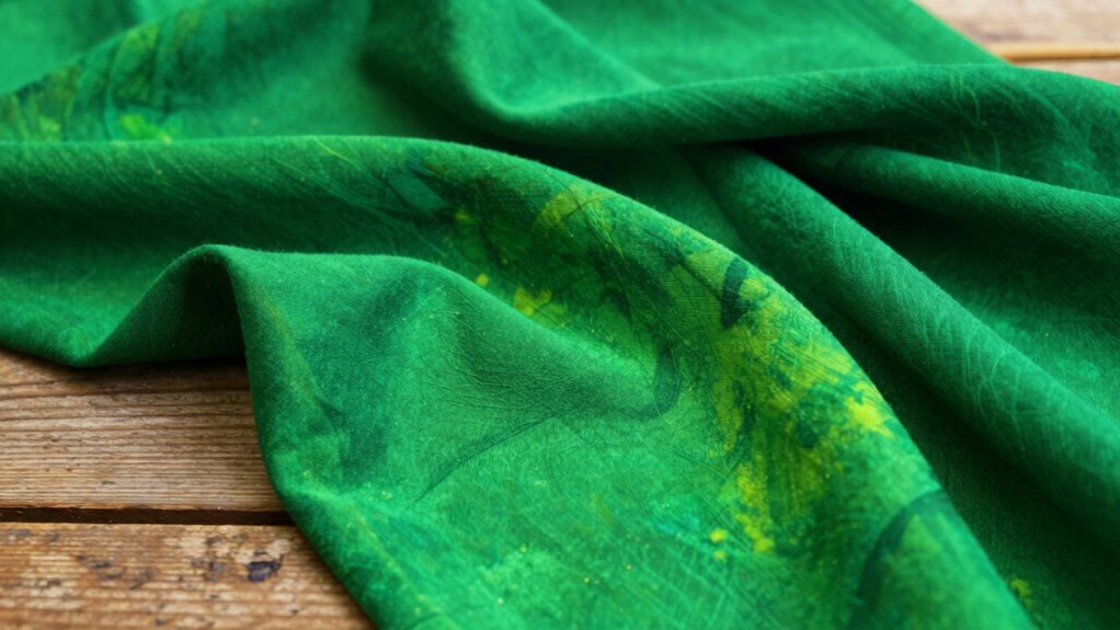

To create a sophisticated, non-neon St. Patrick’s Day green, focus on balancing complementary colors like red or orange with your green to tone down brightness. Avoid mixing blue and yellow alone, which can produce harsh neon hues. Instead, adjust hue temperature by adding warmer tones to soften the green or cooler shades to deepen and mute it. Mastering these subtle color mixing techniques will help you craft elegant, subdued greens that shine without the neon effect.
Key Takeaways
- Incorporate red or orange into green to mute brightness and create earthy, subdued shades.
- Use cool, bluish greens to reduce neon effects and achieve a more natural look.
- Start with muted base colors and adjust with small amounts of complementary hues for depth.
- Warm green tones with yellowish hues can brighten without harshness, balancing vibrancy.
- Focus on hue and temperature shifts to develop elegant, festive greens that avoid neon vibrancy.
Have you ever wondered how artists create vibrant, nuanced colors from just a few basic hues? When it comes to achieving that perfect, subdued St. Patrick’s Day green—one that’s rich without veering into neon territory—you need to understand some key color mixing secrets. Central to this is mastering complementary color schemes and color temperature theory. These principles act as your toolkit for balancing and refining hues so that your green doesn’t scream but instead exudes depth and harmony.
Complementary color schemes are the foundation for creating natural-looking greens. These schemes involve pairing colors that sit opposite each other on the color wheel, such as red and green. When mixed correctly, they can neutralize each other’s brightness, helping you tone down a vibrant green to a more muted, earthy shade. For St. Patrick’s Day, instead of simply mixing blue and yellow to get a bright, neon green, you can incorporate a touch of red or orange into your palette. This subtle addition helps to desaturate the green and give it a more authentic, subdued appearance. Think of it as balancing a scale—adding just enough of the complementary color to mute the intensity without losing vibrancy or richness.
Color temperature theory further guides your mixing process by explaining how warm and cool hues influence each other. Green sits in the middle of this spectrum, but by adjusting the temperature of your base colors, you can create a more natural and less fluorescent green. For instance, if your green appears too bright or electric, try shifting its tone toward cooler, bluish greens or adding a hint of warmth with yellowish tones. Conversely, if it’s too dull, a touch of warmth can liven it up without making it neon. Understanding which colors are warm or cool allows you to manipulate your green’s temperature strategically, ensuring it looks vibrant yet understated—perfect for a festive St. Patrick’s Day palette that’s elegant rather than glaring.
Additionally, starting with muted base colors provides a more controlled foundation for your adjustments, helping you avoid oversaturation and achieve a refined green. The key is to start with a muted base and then fine-tune it with small adjustments based on complementary colors and temperature shifts. Use small amounts of red or orange to tone down overly bright greens, and experiment with adding blue or yellow to shift the temperature. By doing so, you’ll develop a nuanced green that captures the spirit of St. Patrick’s Day without the harshness of neon. These techniques empower you to control the vibrancy and depth of your color, making your artwork or decorations both lively and sophisticated. So next time you mix green, remember that balancing complementary schemes and understanding color temperature can transform your shade from glaring to graceful—bringing that perfect festive touch to your project.
Frequently Asked Questions
Can I Achieve Muted Green Shades With Digital Color Mixing?
Yes, you can achieve muted green shades with digital color mixing. Use a digital palette and start with a base of green, then adjust the color transparency to tone down the vibrancy. Mix in small amounts of white or gray to mute the hue further. Experimenting with transparency levels helps you create softer, more subdued greens perfect for a subtle St. Patrick’s Day look.
What Colors Should I Avoid Mixing for a Dull Green?
Avoid mixing complementary colors like red and green, as they cancel each other out and produce dull, muddy greens, disrupting color wheel harmony. Think of the color wheel as a symphony—pair harmonious shades for vibrant results. To dull green, steer clear of bright reds or oranges, which overpower and dull the hue. Instead, blend muted yellows or blues to achieve a subdued, sophisticated green without losing depth.
How Does Lighting Affect the Appearance of Green Shades?
Lighting effects and monitor calibration markedly influence how green shades appear to you. Bright, natural light can make greens look more vibrant, while dim or artificial lighting may dull their appearance. Ensuring your monitor is properly calibrated helps you see true colors, preventing misjudgment of green shades. By controlling lighting effects and calibrating your display, you can achieve consistent, accurate green tones that match your expectations and needs.
Are There Eco-Friendly Alternatives to Traditional Green Dyes?
Think of nature as your palette, offering eco-friendly alternatives to traditional green dyes. You can use natural dye sources like spinach, nettles, or moss, which provide rich, sustainable colors. Botanical dye methods harness these plant-based options, reducing environmental impact. By choosing these eco-friendly dyes, you turn your project into a vibrant, sustainable masterpiece, proving that you don’t need synthetic chemicals to achieve stunning, natural green shades.
Can Color Mixing Techniques Vary for Different Art Mediums?
Yes, color mixing techniques vary for different art mediums because of factors like the color wheel application and pigment transparency. In painting, you blend colors based on how pigments mix and their transparency levels, while in digital art, you manipulate layers and color settings. You need to understand each medium’s unique properties to achieve accurate color harmony, ensuring your artwork looks vibrant and balanced across various platforms.
Conclusion
Now that you know the secrets to mixing a true St. Patrick’s Day green without that harsh neon glow, you’re ready to craft shades that look natural and vibrant. Remember, patience and a steady hand are your best allies—think of it as your own Renaissance painting. So, grab your palette and let your creativity flow. With these tips, you’ll be celebrating in style, turning your projects into timeless treasures that even a modern-day Leonardo would admire.