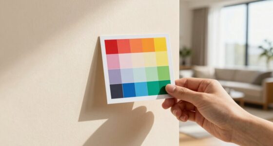
The secret to centering text by eye is understanding that mechanical tools like rulers and grid lines often deceive because they overlook how your eye perceives balance and harmony. Instead of relying solely on measurements, focus on how the text appears in relation to other design elements, making slight adjustments until it feels balanced visually. Developing a keen eye for visual cues helps create genuinely harmonious layouts—stick around to learn how subtle shifts can make a big difference.
Key Takeaways
- Trust visual judgment over mechanical measurements; focus on how text appears relative to other elements.
- Adjust positioning based on visual cues like balance and harmony, not just ruler marks.
- Consider typographic factors such as size, weight, and spacing to achieve perceived center.
- Use subtle shifts and iterative viewing to find the most visually balanced placement.
- Develop an intuitive sense of visual weight and flow to create natural, harmonious alignments.

Have you ever struggled to perfectly center text by eye when designing a document or a webpage? It’s a common challenge, and many designers find themselves questioning whether their work truly looks balanced. The secret to successful eye-centering lies in understanding and applying principles of visual balance and typographic harmony. Rulers and grid lines are helpful tools, but they often fall short because they don’t account for how our eyes perceive space and proportion. To achieve true visual harmony, you need to go beyond the mechanical measurements and develop an intuitive sense of balance.
When you’re eyeballing centered text, don’t rely solely on the edges of your layout or the center mark of your ruler. Instead, focus on how the text appears relative to other elements and the overall composition. Your eye tends to be drawn to areas of high contrast or visual weight, so what might seem perfectly centered geometrically can feel off if the text doesn’t align with the overall flow of your design. Pay attention to the space around your text, and look for ways to create a sense of equilibrium. Sometimes, this means shifting your text slightly, even if it’s not perfectly aligned to the ruler, until it reaches a point where it feels right visually.
Achieving typographic harmony involves more than just horizontal placement. Consider the size, weight, and style of your font—these factors influence how your text interacts with surrounding elements. When your typeface has a strong visual presence, it can throw off the balance if not carefully adjusted. You want your text to resonate with the other elements on the page, creating a seamless, cohesive look. This often means adjusting line spacing, margins, or letter spacing, not just the position. The goal is to make your text feel naturally integrated into the design, rather than artificially centered. Additionally, understanding visual perception can help you better judge the balance and harmony of your typographic layout.

(Upgraded – XL Size) Tshirt Ruler Guide Vinyl Alignment – Shirt Measurement Tool Placement Center Design, DTF Template, Left Chest Logo, Accessories for Cricut, Heat Press Sublimation Iron on HTV
Perfect Alignment, Less Stress – For XL Size: Say goodbye to crooked prints. Urboni’s "Triple Reference" Technique helps…
As an affiliate, we earn on qualifying purchases.
As an affiliate, we earn on qualifying purchases.
Frequently Asked Questions
How Do I Adjust for Uneven Margins When Eye-Centering Text?
When eye-centering text with uneven margins, you should trust your perception but also watch for optical illusions caused by margin discrepancies. Adjust the text slightly left or right, then step back and observe. It’s a balancing act—small tweaks can compensate for optical illusions that make margins seem uneven. Keep refining until the text appears centered to your eye, ensuring it looks visually balanced despite actual margin differences.
What Are Common Visual Illusions That Affect Text Alignment?
You should beware of boldness, as optical illusions and visual biases often distort your perception of text alignment. For example, the “center” may seem off because of uneven letter weights or spacing, while background contrasts can trick your eyes into seeing misalignment. These common visual illusions can lead you to misjudge whether your text is truly centered, so trust your eyes, but verify with careful adjustments.
Can Eye-Centering Be Accurate for Large Blocks of Text?
Yes, eye-centering can be accurate for large blocks of text if you focus on visual consistency and your reader’s perception. Instead of relying solely on rulers, adjust the text by eye, checking how it appears to the viewer. Keep in mind that subtle tweaks improve alignment, making the text feel balanced and harmonious. Trust your eye, and don’t hesitate to make small adjustments to achieve the best visual outcome.
How Does Font Choice Influence Visual Centering?
Your font choice considerably impacts visual centering because typography impact influences how text appears to the eye. Different fonts have varying weights, ascenders, and descenders that can make even perfectly aligned text seem off-center. Font psychology also plays a role, as certain typefaces evoke specific emotions, affecting perception. To achieve balanced visual centering, select fonts that complement your design and adjust spacing accordingly, trusting your eye over rulers.
Are There Tools or Guides to Improve Eye-Centering Accuracy?
Did you know that visual perception can be fooled by optical illusions, making perfect centering tricky? To improve eye-centering accuracy, use tools like grid overlays, optical centering guides, or software with alignment features. These guides help you counteract the natural quirks of perception, ensuring your text appears balanced. Practice with these tools, and you’ll develop a sharper eye for visual balance, even when rulers can’t be trusted.

Logos that Last: How to Create Iconic Visual Branding
As an affiliate, we earn on qualifying purchases.
As an affiliate, we earn on qualifying purchases.
Conclusion
Now that you know the secret to centering text by eye, you’re armed with a tool sharper than any ruler. Trust your instincts—they’re the compass guiding your design ship through tricky waters. Remember, perfection isn’t always about measurements but about the balance you feel. With a little practice, your eye will become a finely tuned instrument, turning your layouts into a dance where everything falls into place effortlessly, like stars aligning in the night sky.

Westcott GA-96 Computer Point & Pica Ruler, Transparent Graphic Arts Ruler, 12 Inch
Graphic Design Ruler: A must-have graphic design tool, this clear drafting ruler is calibrated in 16ths to the…
As an affiliate, we earn on qualifying purchases.
As an affiliate, we earn on qualifying purchases.

EasyComforts Eye Drop Guide
Soft flexible cup
As an affiliate, we earn on qualifying purchases.
As an affiliate, we earn on qualifying purchases.