To build depth into textile color combinations, start with a base hue and layer lighter or darker shades for dimension. Incorporate diverse textures like silk, velvet, or linen to catch light and add interest. Play with scale by mixing large color blocks with intricate details, and balance contrasts to avoid overwhelming the eye. Strategic layering of colors, textures, and scales creates visual richness. Keep exploring these techniques, and you’ll discover how to craft truly dynamic, layered textiles.
Key Takeaways
- Start with a base color and layer lighter or darker shades for dimension and subtle gradients.
- Incorporate contrasting textures like silk, velvet, and linen to catch light differently and add visual depth.
- Use varied scale and detail, combining large blocks with intricate embroidery or woven patterns.
- Balance color contrast to create harmony and avoid jarring combinations for a cohesive look.
- Layer textures strategically to enhance light play, shadow, and overall richness in the textile design.

Creating depth in textile color combinations isn’t just about pairing contrasting hues; it’s about layering shades to add richness and complexity to your designs. When you aim to build depth, you need to think beyond simple color contrast. Instead, focus on how different shades interact and how texture layering can amplify this effect. By combining varying intensities of color and integrating diverse textures, you can create textiles that feel dynamic and visually engaging.
Layer shades and textures to create rich, dynamic textile designs full of depth and visual interest.
Start with a base color that sets the overall tone of your design. From there, introduce secondary shades that are either lighter or darker, creating a subtle gradient that adds dimension. For example, if your base is a deep blue, layering in lighter blues or muted grays can give the design a sense of movement and depth. This approach allows your eye to move seamlessly through the fabric, emphasizing the layered complexity. Remember, the key to effective color contrast isn’t just using stark opposites; it’s about balancing shades so they complement each other, giving your piece a nuanced richness.
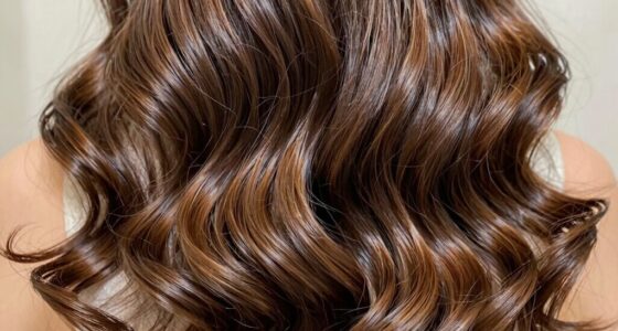
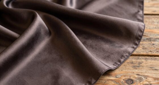
Texture layering plays an equally essential role. Incorporate different fabric surfaces—smooth silk, rougher tweed, soft velvet, or textured linen—to enhance the visual depth. These textures catch light differently, which accentuates the layered colors and adds tactile interest. When you combine a glossy, smooth surface with a matte, textured one, you create a visual dialogue that invites closer inspection. This contrast in texture, paired with a thoughtful color palette, elevates the depth of your textile design. Additionally, understanding how color interactions influence perception can help you make more deliberate choices in your layering process. Exploring visual perception in textile design can deepen your understanding of how viewers interpret layered compositions.
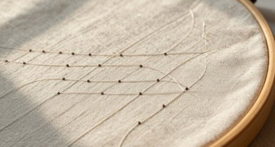
You should also consider the scale of your color and texture application. Larger blocks of color with subtle texture variations can establish a solid foundation, while smaller, intricate details like embroidery or woven patterns introduce complexity. These minute details can serve as focal points, drawing attention and adding layers of visual interest. By playing with scale and contrast, you build a multi-dimensional effect that feels alive and sophisticated. Incorporating layering techniques can further enhance these effects, allowing for even more nuanced depth and richness.
Ultimately, building depth in textile color combinations demands a strategic balance of color contrast and texture layering. Use contrasts thoughtfully, avoiding overly jarring combinations, and layer textures purposefully to catch light and shadow. As you experiment with these elements, you’ll craft textiles that are not only visually compelling but also rich with depth, inviting viewers to explore every nuance of your design.

Homiest White Satin Fabric by The Yard, 1 Yard x 58 Inch Charmeuse Satin Fabric Silky & Shiny Cloth Fabric, Smooth Bridal Satin Fabric for Wedding Dress, Clothing Making, DIY Crafts, Sewing
WIDE USE SCENARIOS – By upgrading the production process, this silky satin fabric is softer than traditional smooth…
As an affiliate, we earn on qualifying purchases.
As an affiliate, we earn on qualifying purchases.
Frequently Asked Questions
How Do Lighting Conditions Affect Perceived Color Depth?
Lighting conditions directly influence how you perceive color depth through variations in light reflection and color saturation. Bright, natural light enhances color saturation, making colors appear more vibrant and giving them more depth. Dim or uneven lighting reduces color saturation and alters light reflection, causing colors to seem flatter and less dynamic. To create rich textile color combinations, consider how different lighting impacts perception and adjust your color choices accordingly for ideal depth.
Can Texture Influence the Depth of Color Combinations?
Yes, texture can influence the depth of color combinations. You notice how different textures, like smooth versus rough fabrics, affect color contrast and perception. Material transparency also plays a role; transparent or semi-transparent textiles can add layers and depth, making colors appear richer and more dynamic. Combining varied textures and transparency levels enhances visual interest, creating a multi-dimensional effect that draws the eye and adds sophistication to your textile design.
Which Color Schemes Best Enhance Visual Depth?
Your best bet for enhancing visual depth is to use monochromatic harmony and complementary contrast. Monochromatic schemes create a subtle, layered effect that feels endless and immersive, while complementary contrast adds vibrant pops that push colors forward. Combining these schemes gives your textiles a dynamic, multi-dimensional look. Think of it as a visual symphony, where harmony and contrast dance together to produce a rich, mesmerizing depth that draws the eye in.
How Does Fabric Choice Impact Color Layering?
Your fabric choice impacts color layering through fiber properties and dye absorption. Natural fibers like cotton and silk absorb dye deeply, creating rich, layered hues, while synthetic fibers reflect light differently, adding subtle depth. Heavier fabrics can hold more dye, enhancing color intensity and layering, whereas lighter fabrics offer transparency and delicate layering effects. Choosing fabrics based on their dye absorption and fiber properties allows you to build more nuanced and visually interesting color combinations.
Are There Cultural Considerations in Color Depth Perception?
Think of color depth perception as a tapestry woven with cultural symbolism and regional preferences. You need to understand that different cultures view colors uniquely—what’s vibrant in one region might carry symbolic weight elsewhere. By respecting these nuances, you can craft textile combinations that resonate deeply, enriching your designs. Being aware of regional preferences guarantees your color choices communicate effectively and honor the cultural context, adding genuine depth to your work.

KKJIAF 1 Yard Black Stretch Velvet Fabric 60" Wide for DIY Crafts
✨️Excellent Fabric: This velvet fabric is composed of 90% polyester fiber and 10% spandex, which allows it to…
As an affiliate, we earn on qualifying purchases.
As an affiliate, we earn on qualifying purchases.
Conclusion
Now that you’ve explored how to build depth into textile color combinations, remember, it’s all about playing with shades, textures, and contrasts. Don’t be afraid to experiment like a true Renaissance artist—think of color as your palette of possibilities. With a keen eye and a bit of daring, you’ll create textiles that captivate and surprise, turning your designs into timeless masterpieces, much like the great works from the age of Leonardo. Happy designing!

Simple&Opulence 100% Nature Pure Linen Fabric 78 Inch by the Yard, Plain Solid Color Linen Fabric for Sewing, Embroidery, Clothing, Needlework, Bag, Tablecloths, Garments Craft Accessories(White)
[Large Size]: Each piece measures 78 inches(200cm) x 1 yard(36 inches/91.44cm), 160GSM, meeting your different needs for DIY…
As an affiliate, we earn on qualifying purchases.
As an affiliate, we earn on qualifying purchases.

Qurated Colors Seasonal Color Analysis Card – Acrylic Color Palette Guide for Shopping, Makeup & Outfits with Velvet Pouch (True Spring)
True Spring Seasonal Color Palette: Features warm, bright, and lively shades designed to help True Spring palettes coordinate…
As an affiliate, we earn on qualifying purchases.
As an affiliate, we earn on qualifying purchases.