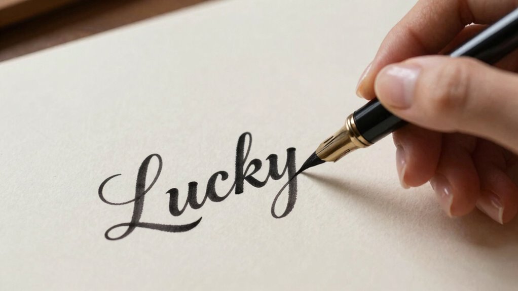
To letter ‘lucky’ without it looking corny, choose an elegant, balanced font style that feels refined and timeless. Use a subtle color palette, like soft pastels, black and white, or metallic accents, to elevate the look. Keep your strokes clean and confident to guarantee a polished finish. Avoid overly decorative or playful fonts that might seem fake. If you want guidance on perfecting your style and adding subtle details, explore the tips below.
Key Takeaways
- Choose a clean, modern font style that avoids overly playful or ornate scripts.
- Limit your color palette to subtle, sophisticated shades like black, gold, or soft pastels.
- Practice steady strokes on scrap paper or digitally to ensure smooth, professional lines.
- Use minimal embellishments and avoid excessive flourishes to keep the design balanced.
- Focus on harmony between font, color, and layout to create an elegant, polished look.

Learning how to letter ‘Lucky’ can add a charming touch to your projects and crafts. When you’re working on lettering, choosing the right font styles and color choices makes all the difference in guaranteeing your work feels polished and tasteful, not cheesy or overdone. To start, pick font styles that match the tone you want to convey. For a more sophisticated look, opt for elegant scripts or clean sans-serif fonts. If you want something more playful, a hand-lettered or whimsical style can work well. The key is to balance style with simplicity—avoid overly elaborate fonts that can become difficult to read or seem too busy. Consider combining a bold font with a more delicate script for contrast, but do so sparingly to maintain harmony.
Choosing the right font and color balance elevates your ‘Lucky’ lettering—keep it simple, elegant, and harmonious.
Color choices also play a vital role in making your lettering look intentional and refined. Instead of relying on bright, neon colors that might scream “try-hard,” choose a more subdued palette. Metallic gold or silver can add a touch of elegance, especially for a ‘Lucky’ theme, hinting at prosperity and good fortune. Soft pastel shades or classic black and white can also create a timeless appearance. When selecting colors, think about the overall vibe you want to evoke—are you aiming for lucky charm, sophistication, or whimsy? Keep your color palette minimal; two or three complementary shades tend to look more cohesive and less cluttered. Remember, contrast is key, so guarantee your text stands out against the background without clashing. Using appropriate fonts can also help prevent your work from looking amateurish and enhance overall professionalism.
Once you’ve chosen your font styles and colors, practice your lettering on scrap paper or a digital platform first. This helps you see how the styles and colors work together before committing to your final piece. When you’re ready, apply your choices with confidence, keeping your hand steady and your strokes deliberate. If you’re working with digital tools, take advantage of vector fonts and color fill options to refine your work. For hand lettering, use quality pens or brushes suited to your chosen style. A steady hand and patience will help you avoid those awkward, uneven lines that can make your work look amateurish.
Ultimately, the secret to lettering ‘Lucky’ without it looking corny lies in subtlety and balance. Use font styles that enhance rather than overpower your message, and select color choices that evoke the right mood without overwhelming. With a little practice, you’ll create charming, tasteful lettering that adds a special touch to your crafts and projects, celebrating luck in a way that feels genuine and refined.
Frequently Asked Questions
What Are Some Common Mistakes to Avoid When Lettering “Lucky”?
When lettering “lucky,” avoid clashing color contrast that makes the word hard to read, and inconsistent spacing that disrupts flow. Don’t overcrowd the design with too many colors or styles, which can look busy or amateurish. Keep your spacing consistent to maintain balance, and choose colors that complement each other. These mistakes can make your lettering look unprofessional, so pay attention to contrast and spacing for a polished, eye-catching result.
Which Colors Best Complement a “Lucky” Lettering Design?
You should choose vibrant shades like gold, green, and red for your lucky lettering design. These colors create a strong color pairing that evokes luck and positivity. Focus on shade selection to guarantee the hues complement each other well, avoiding clashing tones. Bright, metallic, or pastel shades can add a lively, harmonious feel without looking cheesy. Keep the palette balanced, and your lucky design will look fresh and appealing.
How Can I Incorporate Symbols Into My “Lucky” Lettering?
You can seamlessly incorporate symbols into your lucky lettering by focusing on symbol integration that enhances your design harmony. Choose symbols like four-leaf clovers or horseshoes and subtly weave them into the lettering, ensuring they complement rather than compete with your text. Use consistent style and size, blending the symbols naturally, so they add charm without overwhelming the overall look. This approach keeps your design balanced and visually appealing.
What Tools Are Ideal for Creating Professional-Looking Lettering?
You should use high-quality digital design tools like Adobe Illustrator or Procreate for professional-looking lettering. These tools let you incorporate precise hand lettering techniques with digital finesse, giving your work a polished finish. For a more authentic touch, combine digital design with traditional hand lettering then refine your work digitally. This approach guarantees your “lucky” lettering looks professional, clean, and visually appealing without feeling overly cheesy or forced.
How Do I Choose a Font Style That Feels Both Lucky and Elegant?
Choosing a font style that feels lucky and elegant is like finding a perfect harmony in music. You want matching font styles that complement each other, balancing elegance with a touch of whimsy. Opt for sleek serif fonts paired with delicate script accents, ensuring they don’t overpower each other. Test different combinations, and trust your eye—if it feels just right, you’ve found your lucky, elegant match.
Conclusion
Now that you know how to letter ‘lucky’ without it looking corny, you’re like a skilled gardener tending to a delicate flower. With the right techniques and a steady hand, your design will bloom beautifully without overwatering it with clichés. Remember, subtlety is your best friend—let your creativity grow naturally. Keep practicing, and soon your lettering will stand tall and proud, catching everyone’s eye like a vibrant, healthy garden in full bloom.