Traditional patterns feel “right” because they follow timeless design rules such as symmetry, balance, and natural forms that appeal to your innate sense of harmony. Repetition and rhythmic motifs create visual order, while harmonious colors and cultural symbols add meaning and emotion. Proportions like the Golden Ratio and inspiration from nature guarantee they resonate universally. If you explore further, you’ll discover how these principles work together to create patterns that feel instinctively pleasing and meaningful.
Key Takeaways
- Symmetry and balance create visual harmony, making patterns feel stable and pleasing to the eye.
- Repetition and rhythm produce familiar, dynamic movement that engages viewers naturally.
- Color harmony and cultural symbolism evoke emotional resonance and cultural familiarity.
- Proportional relationships like the Golden Ratio ensure motifs are aesthetically balanced.
- Natural forms and cultural narratives foster authenticity and instinctive connection with patterns.
The Power of Symmetry and Balance
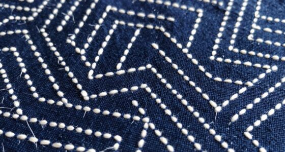
Symmetry and balance are fundamental principles that give traditional patterns their visual harmony and stability. When you observe these patterns, you notice how harmony contrast creates a pleasing sense of order, drawing your eye evenly across the design. This visual harmony reinforces the viewer’s sense of cohesion and unity within the pattern. The balance guarantees that no part overwhelms another, establishing a cohesive structure. Symmetry reinforces this stability by mirroring elements across a central axis, which enhances the viewer’s sense of equilibrium. The deliberate arrangement of shapes and motifs establishes rhythm, guiding your gaze smoothly through the pattern. This structured approach not only reflects cultural values but also makes patterns feel “right,” as your brain naturally appreciates order and predictability. Additionally, water’s reflective qualities in aquatic environments often inspire symmetrical and balanced designs in art and architecture. The perception of order in these patterns taps into innate human preferences for harmony and structure. Ultimately, symmetry and balance craft a timeless visual language that resonates deeply with viewers.
Repetition and Rhythm in Pattern Design

Building on the sense of harmony established by symmetry and balance, repetition and rhythm introduce a dynamic flow to traditional patterns. They create visual movement, guiding your eye across the design with a sense of rhythm. You’ll notice how geometric motifs are repeated in consistent intervals, establishing a predictable pattern that feels familiar yet lively. Texture variation enhances this effect, adding depth and tactile interest, making the pattern more engaging. Repetition can be precise or subtly varied, creating a pulsating rhythm that energizes the design. This interplay of repeating elements and rhythmic flow makes patterns feel natural and instinctively “right.” Incorporating visual harmony principles ensures that the pattern maintains a cohesive and pleasing appearance. When carefully balanced, these principles help create patterns that are both aesthetic and functional. Visualize:
- Geometric motifs aligned in rhythmic sequences
- Alternating textures that emphasize repetition
- Repeating shapes creating a visual pulse
- Variations that introduce subtle surprises
- Patterns flowing seamlessly across surfaces
- AI tools can assist in designing complex, rhythmic patterns efficiently.
The Role of Color Harmony
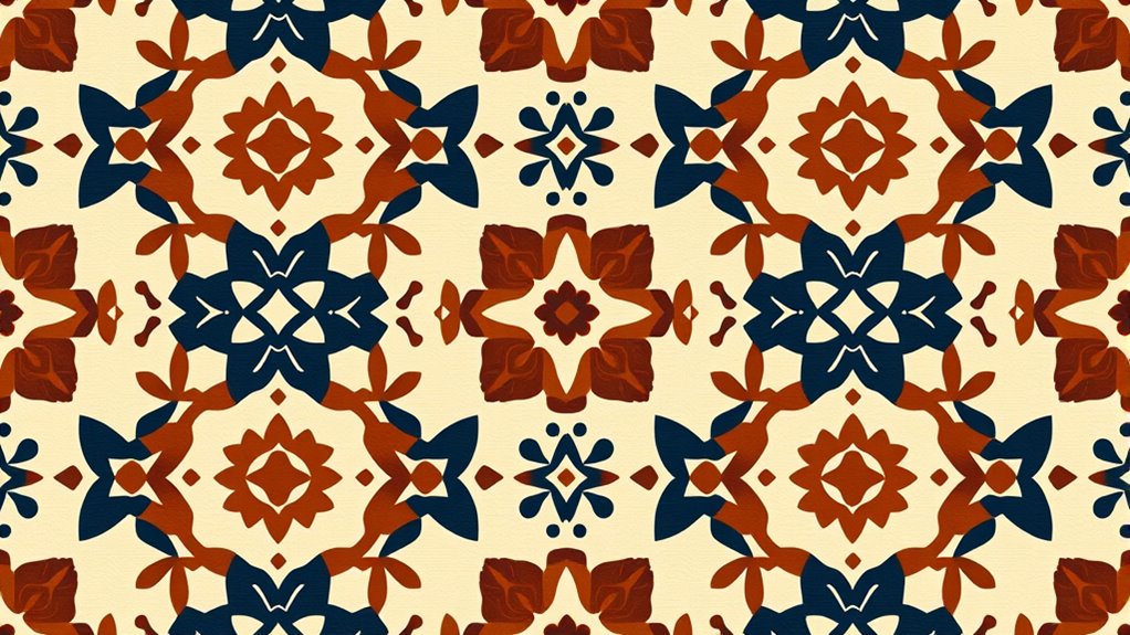
Color harmony is essential for creating visually appealing patterns, and understanding color wheel relationships helps you select complementary or analogous hues. Balancing color contrast guarantees your design is vibrant without becoming overwhelming, while cultural color significance guides you to evoke specific meanings. Mastering these aspects allows you to craft patterns that resonate deeply with viewers. Additionally, incorporating color contrast techniques can enhance the overall visual impact of your designs. Recognizing cultural color symbolism ensures your patterns align with the intended emotional or cultural message.
Color Wheel Relationships
Understanding how colors relate on the wheel is essential for creating visually pleasing patterns. By grasping hue relationships through color theory, you can craft harmonious designs that feel balanced and natural. The color wheel reveals key relationships, such as complementary pairs that contrast vividly, or analogous colors that blend smoothly. These relationships help you develop a sense of visual balance and harmony, guiding your choices to produce more appealing patterns. Imagine:
- Bright reds next to lush greens, creating vibrant contrast
- Soft blues flowing into gentle purples for a calming effect
- Warm oranges blending into earthy browns for warmth and harmony
- Cool teals paired with deep navy for depth and stability
- Bright yellows adjacent to soft creams for freshness and clarity
- Recognizing color harmony principles helps you develop patterns that resonate instinctively, rooted in fundamental color relationships. Incorporating color contrast techniques can further enhance visual interest and harmony in your designs.
Color Contrast Balance
Achieving visual harmony in patterns depends on balancing contrast with harmony. You want elements to stand out without overwhelming the overall design, so managing visual weight is essential. Contrast harmony involves selecting colors that complement each other, creating a pleasing balance between bold and subtle tones. Too much contrast can disrupt the pattern’s unity, while too little may make it dull. The key is to use contrasting colors thoughtfully, ensuring they enhance rather than compete. This balance guides the viewer’s eye smoothly across the pattern, fostering a sense of cohesion. When you master contrast harmony, your pattern feels naturally balanced and pleasing, giving it that “right” feeling that resonates with viewers. It’s all about fine-tuning the visual weight to create a harmonious, engaging design.
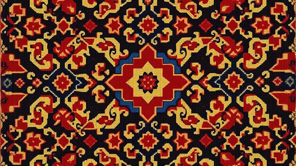
Cultural Color Significance
In many cultures, colors carry meanings and symbolism that influence how patterns are perceived and appreciated. These symbolic meanings stem from traditional associations that shape design choices. When you see red in Chinese patterns, it often signifies luck and prosperity. Blue in Middle Eastern textiles may represent protection and spirituality. Green in Islamic art symbolizes paradise and renewal, while white in Western traditions often stands for purity and peace. These traditional associations guide the harmony of colors within patterns, reinforcing cultural values. Additionally, understanding cultural symbolism can help designers create more emotionally resonant and culturally meaningful patterns. By understanding these symbolic meanings, you can appreciate why certain color combinations feel “right.” They evoke emotional responses rooted in cultural history. This cultural color significance deepens your connection to traditional patterns, making their visual harmony more meaningful and resonant.
Cultural Symbolism and Meaning

Have you ever wondered how traditional patterns convey deeper cultural meanings? It all comes down to symbolic motifs that embody important cultural narratives. These motifs aren’t random; they tell stories, represent beliefs, or symbolize values shared by a community. For example, a pattern featuring a specific animal might symbolize strength or protection, reflecting cultural ideals. When you see these designs, you’re not just noticing decoration—you’re engaging with a visual language that communicates collective identity. These symbols often carry meanings passed down through generations, enriching the pattern’s significance beyond its aesthetic. Interestingly, electric dirt bikes are changing how we think about off-road riding with their innovative technology and design. Recognizing the cultural significance of traditional patterns helps deepen your appreciation for their enduring appeal—they resonate because they connect to shared stories and values embedded within the culture’s fabric. Additionally, understanding Native American dance traditions reveals how movement and symbolism work together to preserve cultural heritage and strengthen community bonds. Moreover, studying the symbolic motifs used in these patterns can reveal insights into historical events and societal values, making each design a layered storytelling tool. Furthermore, exploring the symbolic language embedded in traditional patterns enhances our understanding of their role in cultural identity and continuity.
Proportional Relationships and the Golden Ratio
You can see how natural visual balance guides our perception of beauty, often reflected in the Golden Ratio. This principle embodies aesthetic harmony rooted in mathematical foundations of beauty that many traditional patterns follow. Understanding these proportional relationships helps you create designs that feel intuitively pleasing and balanced.
Natural Visual Balance
Natural visual balance plays a essential role in traditional pattern design, guiding the eye through harmonious proportions that feel instinctively pleasing. You notice how the layout feels right, thanks to the careful distribution of elements that keep the composition stable. This balance isn’t just about size; it involves texture variation and material contrast to add depth and interest. Visual weight is distributed evenly, creating a sense of unity. Imagine:
- A repeating pattern with textured surfaces that catch light differently
- Alternating smooth and rough materials to enhance contrast
- Symmetrical arrangements that evoke stability
- Slight asymmetries balanced by proportional relationships
- Central focal points framed by harmonious spacing
These elements work together, ensuring your eye moves comfortably across the pattern, reinforcing an innate sense of order and natural balance.
Aesthetic Harmony Principles
Aesthetic harmony in traditional patterns relies on proportional relationships that create a sense of order and beauty. The use of the Golden Ratio guides the placement of motifs, ensuring balance and visual appeal. This principle encourages texture variety, adding interest without disrupting harmony. Repeating motifs at proportions derived from these ratios reinforces unity and coherence across the design. To help visualize, consider this table:
| Proportional Element | Effect on Pattern |
|---|---|
| Golden Ratio | Creates natural balance |
| Texture Variety | Adds depth and richness |
| Motif Repetition | Reinforces unity |
| Subdivision Ratios | Guides visual flow |
| Overall harmony | Evokes aesthetic satisfaction |
These relationships underpin why certain patterns feel inherently “right,” blending mathematical precision with artistic intuition.
Mathematical Foundations of Beauty
The Golden Ratio, approximately 1.618, forms the mathematical backbone of many beautiful patterns by defining proportions that are inherently pleasing to the eye. It underpins the sense of mathematical symmetry many traditional designs exhibit, creating balance and harmony. This ratio appears in the spirals of shells, the branching of trees, and classical architecture. Its connection to fractal complexity means patterns repeat at different scales, enhancing visual interest and coherence. When you observe a sunflower’s seed arrangement or a nautilus shell, you’re witnessing nature’s use of this proportion. The Golden Ratio guides the eye smoothly through compositions, contributing to their timeless appeal. It’s a fundamental element that explains why certain patterns feel “right” and resonate on a subconscious level.
- Spirals that grow proportionally
- Repeating patterns at multiple scales
- Balanced divisions of space
- Harmonious arrangements of elements
- Nature’s fractal-like structures
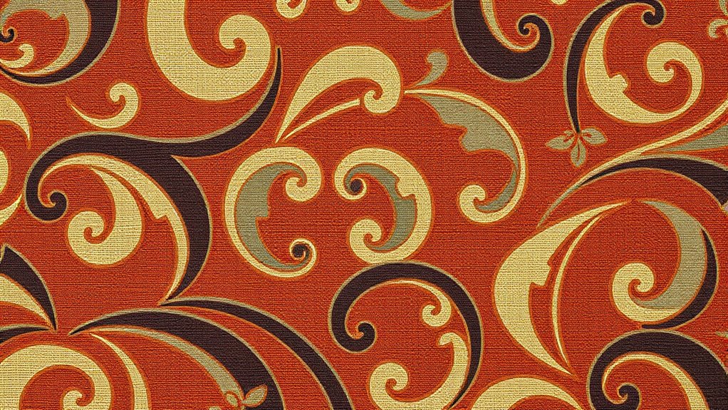
The Influence of Nature and Natural Forms
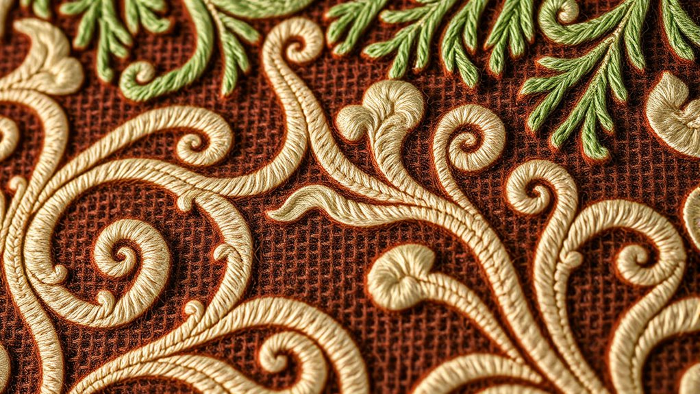
Throughout history, designers have drawn inspiration from the world around them, turning the shapes and patterns found in nature into powerful decorative motifs. This biomimicry inspiration helps create designs that feel familiar and harmonious. Organic forms—like flowing curves, undulating lines, and irregular shapes—mirror natural elements such as leaves, shells, and waves. These forms resonate with our innate sense of balance and comfort, making patterns feel “right.” By incorporating natural shapes, designers tap into a universal language that transcends cultures and eras. Natural forms evoke feelings of growth, vigor, and authenticity, strengthening our connection to the environment. This influence explains why traditional patterns often seem instinctively pleasing; they echo the patterns and structures we see in the natural world every day.
Visual Simplicity and Clarity

Achieving visual simplicity and clarity is essential for creating effective traditional patterns. When you keep patterns straightforward, they communicate their message more clearly. Texture variation should be subtle, avoiding overwhelming the eye. Simplified shapes and limited color palettes help reduce pattern complexity, making the design easier to interpret. By balancing these elements, your patterns become more memorable and harmonious. Imagine a pattern where smooth lines intertwine with gentle shading, creating a sense of order. Think of a repetitive motif with clean edges, avoiding clutter. Picture a design with just a few contrasting colors, enhancing clarity. Visual simplicity invites the viewer to appreciate the pattern’s rhythm without distraction, ensuring the traditional feel remains authentic and engaging. Incorporating design rules based on proven principles further reinforces the pattern’s effectiveness and timeless appeal. Additionally, understanding the cultural symbolism behind certain motifs can deepen the pattern’s meaningfulness and authenticity.
Frequently Asked Questions
How Do Cultural Differences Influence Pattern Preferences Worldwide?
Cultural differences shape your pattern preferences by influencing your perception of symbolism and aesthetics. You find certain patterns appealing because they reflect your cultural symbolism, traditions, and beliefs. Aesthetic diversity across cultures means you’re drawn to intricate designs, bold colors, or minimal styles, depending on your background. These cultural nuances make pattern choices personal, ensuring that what feels “right” varies worldwide, enriching the global tapestry of design.
Can Digital Tools Replicate Traditional Pattern Techniques Accurately?
Can digital tools truly capture pattern authenticity? Digital replication often struggles to accurately mirror traditional pattern techniques because it lacks the nuanced craftsmanship and tactile details that make these patterns unique. While technology can mimic visual elements, it often misses the subtle imperfections and cultural context that give traditional patterns their soul. So, if you seek genuine authenticity, relying solely on digital tools may fall short, and hands-on craftsmanship remains essential.
What Psychological Effects Do Familiar Patterns Have on Viewers?
You feel an emotional comfort when viewing familiar patterns because visual familiarity triggers positive associations in your brain. These patterns evoke a sense of stability and predictability, making you feel more at ease. As your brain recognizes the design, it reduces cognitive effort, creating a calming effect. This psychological response explains why traditional patterns resonate deeply—they tap into your natural preference for order and familiarity.
Are There Universal Patterns Recognized Across All Cultures?
You’ll find that some patterns act like universal language, crossing cultural borders effortlessly. Cross-cultural symbolism and universal motif recognition reveal that certain shapes, colors, and arrangements resonate globally, like a familiar tune everyone knows. These patterns, rooted in shared human experiences, create a sense of connection and understanding, proving that some design elements speak a common language—no matter where you are or what culture you come from.
How Do Patterns Evolve With Modern Design Trends?
Patterns evolve with modern design trends through pattern adaptation and trend integration. You see this when traditional motifs are reimagined with contemporary colors, scales, or materials, making them feel fresh and relevant. As design trends shift, you adapt patterns to fit new aesthetics, blending old and new seamlessly. This ongoing evolution keeps patterns engaging, allowing them to resonate with current tastes while honoring their cultural or historical roots.
Conclusion
Understanding why traditional patterns feel “right” reveals a timeless language of design rooted in symmetry, balance, and harmony. These elements resonate because they mirror natural forms and cultural symbols, creating an intuitive sense of order. Like a familiar melody, they evoke comfort and recognition. Embracing these rules allows you to craft designs that speak universally—proving that, in the end, beauty truly is in the patterns we recognize and trust.