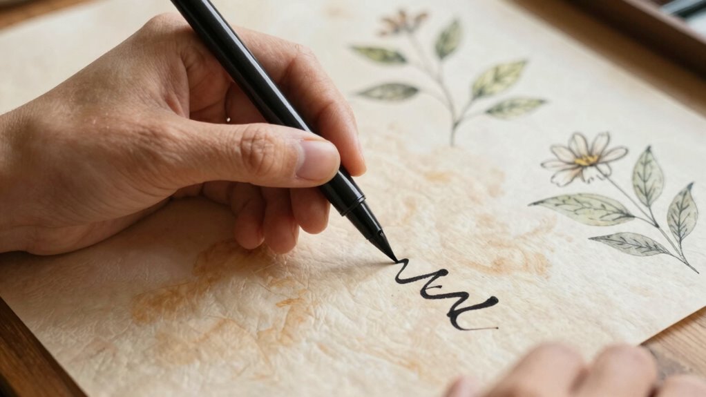

To make your calligraphy feel integrated, focus on creating a strong visual flow that guides the viewer’s eye naturally across your work. Use subtle contrast to highlight key strokes while maintaining overall harmony with consistent style cues, spacing, and stroke angles. Balancing contrast with harmony makes your design feel cohesive and fluid, rather than patchworked. Paying attention to the movement and connection between elements will help unify your piece—if you keep exploring, you’ll discover how to perfect this seamless integration.

Get business pricing on tools and workshop supplies
- Business-only prices and quantity discounts
- Tax-exempt purchasing
- Multiple users, one account, clear invoices
Key Takeaways
- Prioritize consistent style cues and stroke angles to maintain visual harmony throughout the piece.
- Use subtle contrast to emphasize movement without disrupting the overall flow.
- Develop a clear visual rhythm that guides the viewer’s eye smoothly across the work.
- Maintain even spacing and cohesive flourishes to unify the design elements.
- Focus on creating a natural, flowing appearance that feels like an organic extension of hand.
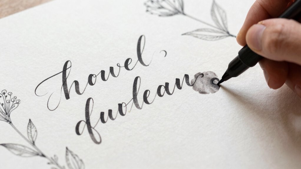
Have you ever wondered how to make your calligraphy feel more cohesive and natural? Achieving a seamless, integrated look isn’t just about perfect letter forms; it’s about creating a visual flow that guides the viewer’s eye effortlessly across your work. One key to this is understanding how to balance handlettering contrast with script harmony. When you master these elements, your calligraphy transforms from seemingly added-on designs into a unified piece that feels intentional and polished.
Mastering contrast and harmony creates seamless, polished calligraphy that flows naturally and feels truly unified.
Start by paying close attention to your handlettering contrast. Contrast involves more than just size differences or thick versus thin strokes; it’s about creating a visual rhythm that emphasizes certain parts of your lettering without overwhelming the entire piece. For example, if you’re working with a script style, vary your stroke weight subtly to highlight natural movement and add interest. However, don’t overdo it—too much contrast can break the flow, making your work appear disjointed. Instead, aim for a gentle interplay between thick and thin strokes that feels organic. This contrast helps your letters stand out, but when used thoughtfully, it contributes to the overall cohesion of your piece, making it feel like a single, flowing entity rather than a collection of separate elements.
Next, focus on script harmony. This means ensuring that all your letterforms work together cohesively, sharing consistent style cues such as stroke angles, spacing, and flourishes. When your script elements are harmonious, they seem to belong together naturally, enhancing the feeling of an integrated composition. To achieve this, decide on a central style or mood before you start. Keep your stroke angles consistent, and pay attention to spacing so that gaps between letters don’t feel awkward or uneven. Incorporate similar flourishes and stylistic details throughout your work to reinforce unity. When your script feels harmonious, it creates a visual language that your audience can follow effortlessly, making the entire piece feel like a single, well-thought-out design. Additionally, understanding the importance of visual rhythm can help you maintain balance and flow throughout your piece.
Finally, to really bring everything together, look for ways to blend your contrast and harmony techniques. For instance, use contrast selectively within a harmonious framework. If your script has a flowing, elegant feel, accentuate certain strokes to highlight movement without disrupting the overall unity. The goal is for your calligraphy to feel like a natural extension of your hand rather than a collection of added-on elements. When contrast and harmony work hand in hand, your calligraphy becomes more than just beautiful writing—it becomes a cohesive work of art that resonates with viewers because of its fluid, integrated appearance.
calligraphy pen set with varied nibs
As an affiliate, we earn on qualifying purchases.
As an affiliate, we earn on qualifying purchases.
Frequently Asked Questions
Can Calligraphy Be Combined With Digital Design Effectively?
Yes, you can effectively combine calligraphy with digital design by focusing on digital blending and font pairing. You should seamlessly blend hand-drawn calligraphy into digital elements, ensuring it doesn’t stand out awkwardly. Pair calligraphy with complementary fonts that enhance your style, balancing organic and structured elements. This approach creates a cohesive look, making your design feel integrated rather than added on, giving a polished, professional appearance.
What Are Common Mistakes That Make Calligraphy Seem Out of Place?
Think of your design like a puzzle; mismatched pieces stand out. Common mistakes include overusing clip art or ignoring font pairing, which makes calligraphy seem out of place. For example, pairing ornate calligraphy with casual fonts can clash. To avoid this, match your calligraphy style with complementary fonts and keep clip art minimal, ensuring your calligraphy feels like a natural part of the overall design rather than an afterthought.
How Do I Choose the Right Calligraphy Style for My Project?
You choose the right calligraphy style by considering your project’s theme and mood. Focus on letterform consistency, ensuring each letter aligns with your overall design. Seek stylistic harmony by matching the calligraphy’s character to your project’s tone—elegant, playful, or modern. Test different styles, and pick one that complements your layout without overpowering it. This approach makes your calligraphy feel naturally integrated, enhancing your project’s visual flow.
Is It Better to Use Traditional or Modern Calligraphy Techniques?
You should lean toward traditional calligraphy techniques if you want to honor the historical context and cultural significance behind the style. Modern techniques offer fresh, creative freedom, but traditional methods connect your work to a rich heritage. Consider your project’s message and audience; using traditional styles can make your piece feel authentic and respectful, while modern approaches can bring a contemporary twist, making the calligraphy more integrated and meaningful.
How Can Color Enhance the Integration of Calligraphy?
A picture is worth a thousand words, so use color to enhance your calligraphy’s harmony. Bright or contrasting colors can create visual balance when chosen thoughtfully, tying the lettering into the overall design. To make it feel integrated, select a color palette that complements your background and other elements. This approach guarantees your calligraphy blends seamlessly, rather than standing apart as an afterthought, making your artwork more cohesive and engaging.
professional brush pens for calligraphy
As an affiliate, we earn on qualifying purchases.
As an affiliate, we earn on qualifying purchases.
Conclusion
By weaving calligraphy seamlessly into your designs, you transform it from a mere ornament into a harmonious voice that speaks with purpose, much like a well-tuned instrument in an orchestra. Remember, the key lies in balance and intention—letting the words flow naturally, as if they were part of the story from the start. When you achieve this integration, your work resonates with the quiet strength of a timeless classic, echoing through the ages.
calligraphy practice paper with guidelines
As an affiliate, we earn on qualifying purchases.
As an affiliate, we earn on qualifying purchases.
As an affiliate, we earn on qualifying purchases.
Halloween Picks
halloween
As an affiliate, we earn on qualifying purchases.