
To improve your paper craft composition without adding more, focus on optimizing existing materials through strategic placement and careful use of space. Enhance contrast by adjusting colors and textures, like adding gloss or matte finishes, to create focal points. Play with layering, folding, or curling elements to add depth and visual interest. Maintain balance and harmony with thoughtful spacing and negative space, ensuring your design looks polished. Keep experimenting with these techniques to discover even more ways to elevate your work.

Get business pricing on tools and workshop supplies
- Business-only prices and quantity discounts
- Tax-exempt purchasing
- Multiple users, one account, clear invoices
Key Takeaways
- Enhance visual hierarchy by applying contrasting colors to highlight focal points without adding extra elements.
- Increase depth and interest through texture variations like embossing, folding, or layering existing materials.
- Adjust element placement strategically to improve balance and guide the viewer’s eye smoothly across the composition.
- Utilize negative space intentionally to prevent clutter and emphasize key features.
- Refine the design by manipulating textures and colors to maximize visual impact without introducing new pieces.
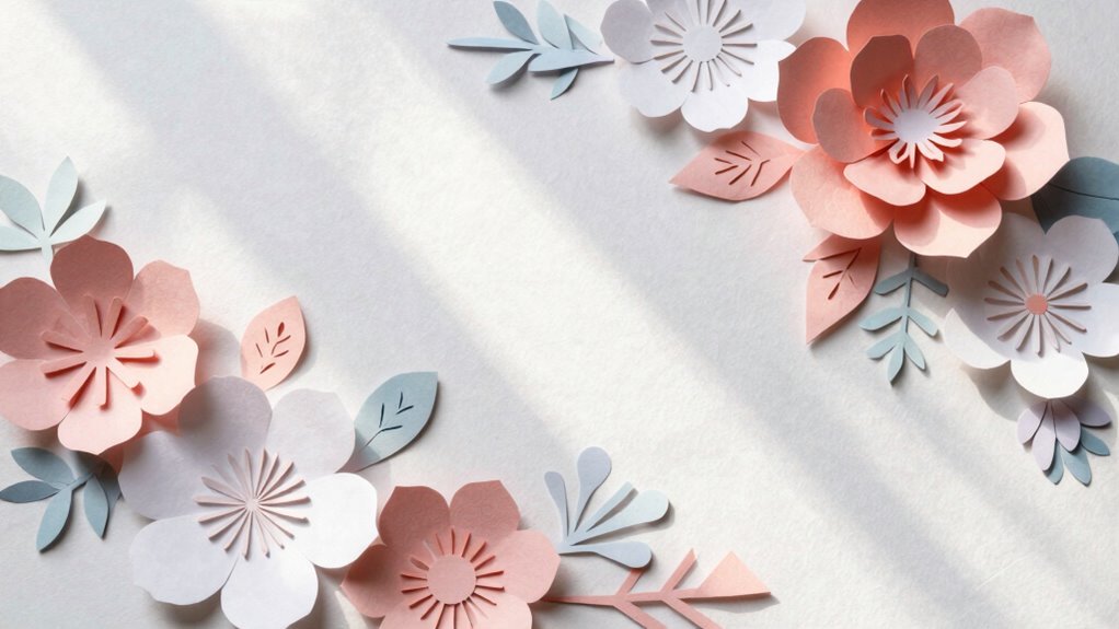
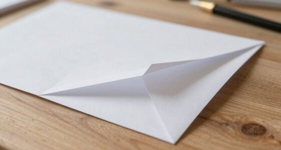
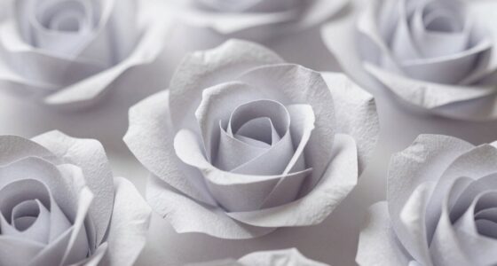
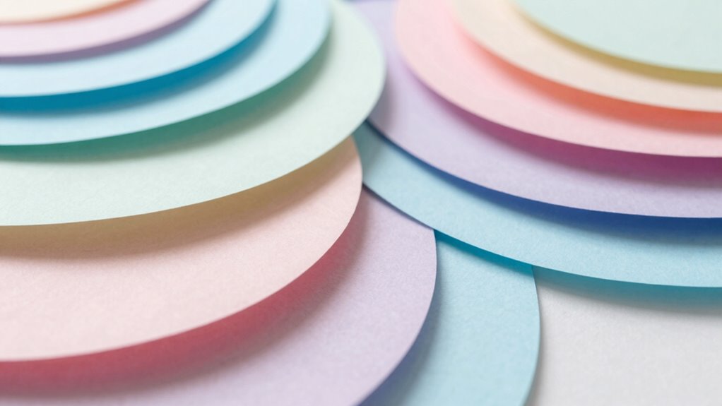
Creating impressive paper craft compositions requires more than just following instructions; it involves understanding how to arrange elements harmoniously. You don’t need to add more pieces to make your work stand out. Instead, focus on how existing elements interact visually and tactilely. One of the most effective ways to elevate your composition is by paying close attention to color contrast. Bright, vivid colors against muted or darker backgrounds create focal points that draw the eye naturally. Think about how contrasting hues can highlight specific parts of your craft without cluttering the design. For example, a splash of red against a sea of green can make a particular element pop, guiding the viewer’s attention exactly where you want it. It’s not just about choosing bold colors but understanding how they work together to produce a balanced visual flow. Additionally, material texture plays a crucial role in adding depth and interest, allowing you to enhance your design without increasing its size or complexity. When you incorporate different textures—smooth, rough, glossy, or matte—you add depth and tactile interest without adding more layers or elements. Think about how crinkled paper contrasts with sleek, flat surfaces or how embossed details can catch the light differently. These subtle variations invite viewers to explore your work more closely, making the composition feel richer and more dynamic. You don’t need additional pieces to achieve this; you just need to manipulate the existing materials. For instance, folding or curling certain parts can introduce texture, while layering or distressing paper can add visual interest. Playing with material textures helps create a sense of dimension and complexity, making your composition more engaging. Furthermore, experimenting with element placement can help you achieve a more intentional and harmonious layout, guiding the viewer’s eye smoothly across the piece. Even small adjustments in positioning can dramatically impact how your design feels—whether it looks balanced, energetic, or calm. Proper spatial arrangement is essential to create a cohesive and pleasing overall effect, ensuring that each element contributes to the harmony. Thoughtful use of color contrast can also help establish a clear visual hierarchy, directing attention to the most important parts of your work. The way elements relate to each other in space also influences the overall harmony of your composition, which is why thoughtful visual balance is key. Use negative space intentionally to give your focal points room to breathe, preventing your design from becoming cluttered. Combining thoughtful placement with strategic use of color contrast and material texture will make your work more cohesive and striking, all without the need for extra pieces. In essence, refining your paper craft composition hinges on how well you utilize what’s already there. By emphasizing color contrast, experimenting with material textures, and paying attention to placement, you can elevate your projects *considerably*. This approach allows you to craft visually compelling pieces that feel complete and polished, all while keeping your work streamlined and efficient.
matte finish paper craft supplies
As an affiliate, we earn on qualifying purchases.
As an affiliate, we earn on qualifying purchases.
Frequently Asked Questions
Can Color Contrast Enhance Paper Craft Composition?
Yes, color contrast can definitely enhance your paper craft composition. By applying contrasting colors, you create visual interest and draw attention to specific areas. Focus on achieving color harmony to guarantee your contrasts complement rather than clash, maintaining overall aesthetic balance. This technique helps you achieve a dynamic, engaging design without adding more elements, making your paper craft look polished and thoughtfully planned.
How Does Lighting Affect Paper Craft Presentation?
Lighting considerably impacts your paper craft presentation by emphasizing shadow depth and guiding viewers’ attention. Proper light positioning creates natural shadows that add dimension and realism, making your craft stand out. Experiment with angles to achieve desired shadow effects, enhancing depth without adding more elements. By adjusting light placement, you highlight textures and details, making your paper craft more visually appealing and professionally finished.
What Role Does Texture Play in Composition?
Texture plays a crucial role in composition by creating tactile variation and surface interest, making your paper craft more engaging. You can achieve this by combining smooth, rough, glossy, and matte surfaces, which add depth and visual intrigue. Using contrasting textures draws the eye and guides viewers through your piece, enriching the overall aesthetic without adding more elements. Incorporate diverse textures wisely to elevate your paper craft’s complexity and appeal.
Is Symmetry Always Better in Paper Crafts?
Symmetry isn’t always better in paper crafts; asymmetry balance can create more visual interest and dynamic compositions. You should consider using a focal point to draw attention and guide the viewer’s eye through the design. By intentionally shifting elements off-center, you add energy and movement, making your craft more engaging. Experiment with asymmetry to find a harmonious balance that enhances your overall composition without needing to add more elements.
How Can Negative Space Improve Overall Design?
Negative space enhances your paper craft design by creating visual balance and directing focus. It allows your main elements to breathe, preventing clutter and making the composition more appealing. By thoughtfully incorporating negative space, you guide the viewer’s eye smoothly across your work, highlighting key features. This approach elevates your overall design, making it more harmonious and engaging without the need to add more elements.
embossing tools for paper crafts
As an affiliate, we earn on qualifying purchases.
As an affiliate, we earn on qualifying purchases.
Conclusion
Now that you’ve learned to refine your paper craft without adding more, your creation becomes a delicate dance of balance and harmony. Think of your composition as a symphony, where each fold and cut plays a crucial note—no extra instruments needed. Trust your eye to guide the arrangement, like a gentle breeze shaping a sculpture in mid-air. With patience and precision, you’ll craft a masterpiece that speaks volumes through its elegance and thoughtful simplicity.
layering and folding paper craft materials
As an affiliate, we earn on qualifying purchases.
As an affiliate, we earn on qualifying purchases.
color contrast paper craft accessories
As an affiliate, we earn on qualifying purchases.
As an affiliate, we earn on qualifying purchases.
Fall Picks
fall essentials
As an affiliate, we earn on qualifying purchases.