The hidden rule behind better handmade invitations is mastering visual harmony by thoughtfully integrating color and typography. You should choose colors that support the event’s tone—like pastels for romance or bold hues for excitement—and pair them with fonts that match the mood. Limiting font choices helps keep things clear and organized. When you consider how colors and fonts work together, your invitations become more cohesive and memorable. Keep going to discover how this balance elevates your designs even further.

Get business pricing on tools and workshop supplies
- Business-only prices and quantity discounts
- Tax-exempt purchasing
- Multiple users, one account, clear invoices
Key Takeaways
- Achieve visual harmony by balancing color schemes and typography to create a cohesive, appealing design.
- Use complementary or analogous colors to enhance contrast and serenity, guiding the viewer’s eye naturally.
- Limit font choices to two or three that complement each other, ensuring clarity and enhancing overall aesthetic.
- Integrate color and typography thoughtfully to reinforce the event’s mood and message effectively.
- Apply principles of visual harmony to create a seamless flow, elevating the invitation from ordinary to extraordinary.
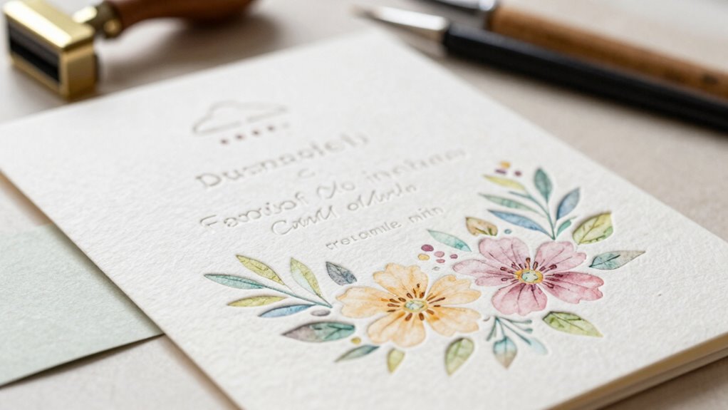
Have you ever wondered how to create handmade invitations that look both beautiful and cohesive? The secret lies in understanding a fundamental design rule that many overlook: harmony. When you combine thoughtful color choices and intentional typography, your invitations will not only stand out but also convey the right mood and message effectively. It’s all about creating a visual flow that feels natural and pleasing to the eye.
Start with color theory. Instead of randomly picking colors, consider how different hues interact with each other. Complementary colors—those opposite each other on the color wheel—create vibrant contrast, making elements pop. Analogous colors, which sit next to each other, produce a harmonious and serene look, perfect for elegant occasions. You can also use monochromatic schemes by varying shades of a single hue for a sophisticated feel. The key is to select a palette that aligns with the event’s tone and mood. For example, soft pastels evoke romance, while bold reds and blacks suggest formality or excitement. When you apply color thoughtfully, your invitations will feel cohesive, guiding the viewer’s eye naturally from the headline to the details. Paying attention to color harmony helps ensure your designs are both attractive and effective. Additionally, understanding visual harmony principles can help you refine your overall design.
Typography choices are equally critical. The fonts you select set the tone and influence how your message is perceived. Combining too many fonts can create chaos, so limit yourself to two or three at most. A good rule is to pair a decorative or script font for headings with a clean, easy-to-read sans-serif or serif font for the body text. Make sure the fonts you choose complement each other, either through style or mood. For instance, pairing a modern font with a classic script can balance elegance with clarity. Pay attention to size, spacing, and alignment—these details help your invitation look polished and organized. When typography is consistent and well-chosen, it enhances readability and reinforces the overall aesthetic.
The real magic happens when you bring color theory and typography choices together. When your colors support the message and your fonts align with the event’s vibe, your invitation will feel unified. This harmony creates an intuitive experience for the recipient, making them more excited about attending. Remember, the goal isn’t just to make something pretty—it’s to craft an invitation that communicates clearly and resonates emotionally. One way to ensure this is by understanding the fundamental principles of visual harmony, which guide how different design elements work together seamlessly. By mastering these design principles, you’ll unlock the hidden rule that elevates your handmade invitations from nice to extraordinary. When you focus on creating visual harmony through color and type, your invites will leave a lasting impression that truly reflects the occasion’s essence.
As an affiliate, we earn on qualifying purchases.
Frequently Asked Questions
How Do I Choose the Right Color Scheme for My Invitation?
To choose the right color scheme for your invitation, focus on color harmony to create a balanced look. Consider the mood you want to set—soft pastels evoke elegance, bold colors convey excitement, and muted tones offer sophistication. Think about the event theme and your audience, and pick colors that complement each other. This approach guarantees your invitation visually communicates the right tone and feels cohesive, making a lasting impression.
What Materials Are Best for a Professional-Looking Handmade Invitation?
Think of your invitation as a canvas waiting to be brought to life. For a professional look, choose high-quality, sturdy paper with a smooth or lightly textured surface. Use calligraphy techniques that flow effortlessly for elegance. Paper texture options like linen or cotton add sophistication, while thick cardstock provides durability. Combining these materials and techniques guarantees your handmade invitation looks polished, like a work of art ready to impress your guests.
How Can I Add a Personal Touch Without Cluttering the Design?
You can add a personal touch by using thoughtful personalization techniques, like handwritten names or small, meaningful symbols. Keep embellishments clutter-free by choosing subtle accents, such as delicate ribbons or minimalist stamps, that enhance without overwhelming. Focus on sparing use of embellishments and let your message stand out. This balance creates a personalized, elegant invitation that feels special without sacrificing clarity or style.
What Tools Are Essential for Creating Detailed Designs?
You need essential tools like calligraphy techniques and digital design tools to create detailed designs. Calligraphy pens and brushes help add elegant, personalized touches, while digital design software like Adobe Illustrator or Procreate allows precise, intricate detailing. These tools enable you to craft intricate patterns, lettering, and embellishments, giving your handmade invitations a professional, refined look. Combining traditional calligraphy skills with modern digital tools offers a perfect balance for detailed, beautiful designs.
How Do I Ensure My Invitation Is Durable and Long-Lasting?
Worried your handmade invitation won’t last? You can guarantee invitation longevity by choosing high-quality, durable materials like heavyweight cardstock or waterproof paper. Seal your designs with a protective coating or laminate to prevent wear and tear. Store your invitations in a cool, dry place away from sunlight. These steps help preserve your craftsmanship and keep your invitations looking beautiful for years, making them a lasting keepsake.
As an affiliate, we earn on qualifying purchases.
Conclusion
Now that you understand the hidden design rule, you hold the key to transforming simple invitations into mesmerizing works of art. Think of your design as a gentle compass guiding the eye, creating harmony and intrigue. When you balance elements with intention, every invitation becomes a story waiting to be told. So, trust your instincts and let your creativity sail — because the true magic lies in the details you craft with love.
As an affiliate, we earn on qualifying purchases.
customizable invitation templates
As an affiliate, we earn on qualifying purchases.
As an affiliate, we earn on qualifying purchases.
Fall Picks
fall essentials
As an affiliate, we earn on qualifying purchases.