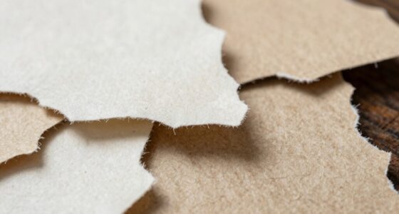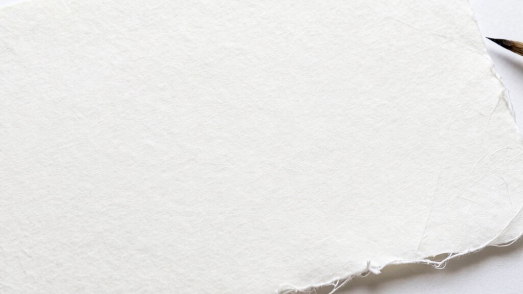

To use white space like a pro in handmade paper design, focus on creating visual breathing room that emphasizes your key elements. Use strategic white space to guide attention, balance textures, and enhance color contrast. Surround bold hues with white space to make them pop and frame textured areas for tactile appeal. Effective placement of white space transforms clutter into elegance and harmony. Keep exploring for more tips on mastering this essential design skill.

Get business pricing on tools and workshop supplies
- Business-only prices and quantity discounts
- Tax-exempt purchasing
- Multiple users, one account, clear invoices
Key Takeaways
- Use white space to create visual breathing room, emphasizing key design elements and preventing clutter.
- Surround bold colors with white space to enhance contrast and direct viewer focus effectively.
- Frame textured areas with white space to highlight tactile details and maintain visual clarity.
- Strategically balance white space to guide the viewer’s eye and establish visual rhythm.
- Combine white space with color contrast and texture variation for a balanced, professional handmade paper design.

White space, often overlooked, is a powerful tool in handmade paper design that can elevate your work from cluttered to enchanting. When you use white space intentionally, you create visual breathing room that draws attention to your focal points and enhances overall harmony. This space isn’t just empty; it functions as a frame that emphasizes your design elements. To master this, you need to understand how to balance the white space with your paper’s textures and colors.
Color contrast plays a pivotal role here. When you leave ample white space around your design elements, it makes the colors pop more vividly. For example, if you incorporate bold, saturated hues, surrounding them with generous white space will make those colors stand out sharply. Conversely, if you’re working with softer, pastel shades, white space adds a gentle elegance, preventing the design from feeling overcrowded. The key is to use white space to create a striking contrast that guides the viewer’s eye directly to your main features.
Texture variation is equally important in using white space effectively. Handmade paper inherently offers diverse textures—rough, smooth, fibrous, or embossed—that add depth to your design. When you leave white space around textured areas, you allow each surface to be appreciated on its own. This deliberate separation prevents the textures from blending into a chaotic mess and instead highlights their unique qualities. For instance, a textured flower on a smooth background benefits from white space that frames it, making the tactile details more noticeable and engaging. It also prevents the design from feeling overwhelming, especially when combining multiple textures. Recognizing the importance of visual hierarchy can further help you prioritize elements within your design.
Using white space strategically means you’re not just leaving gaps but actively shaping the viewer’s experience. It creates a rhythm, directing attention and giving each element room to breathe. By playing with color contrast, you can make your focal points more impactful, and through texture variation, you add richness and tactile interest. When these elements are paired with well-placed white space, your handmade paper designs become more balanced, sophisticated, and visually compelling. Additionally, understanding the role of white space as a framing device can significantly improve the overall harmony and professionalism of your work.
handmade paper design white space tools
As an affiliate, we earn on qualifying purchases.
As an affiliate, we earn on qualifying purchases.
Frequently Asked Questions
Can White Space Improve the Readability of Handmade Paper Designs?
Yes, white space can substantially improve the readability of your handmade paper designs. By emphasizing minimalist aesthetics, you create a clean, uncluttered look that guides the viewer’s eye. White space helps establish a clear visual hierarchy, making important elements stand out and ensuring the message isn’t lost. This balance not only enhances readability but also adds elegance, making your design more inviting and easier to understand.
What Types of Handmade Paper Work Best With White Space?
You’ll find that smooth, lightly textured handmade papers work best with white space because they create a subtle contrast that highlights your design without overwhelming it. Opt for papers with a harmonious color palette to maintain balance and guarantee the white space remains effective. The key is to balance texture contrast and color harmony, allowing your design to breathe and making the focal points stand out beautifully.
How Does White Space Affect the Perceived Value of Handmade Paper Products?
White space enhances the perceived value of your handmade paper products by emphasizing a minimalist aesthetic and showcasing artistic expression. It creates an elegant, refined look that suggests quality and sophistication. When you strategically use white space, your designs appear more balanced and intentional, making your work stand out. This perception of exclusivity and craftsmanship can attract discerning customers who appreciate the artistry behind handmade paper, elevating your product’s overall value.
Are There Cultural Differences in Using White Space in Design?
You’ll notice that cultural nuances influence how white space is used, like a delicate dance across a canvas. In some cultures, generous white space signifies purity and calm, while others see it as an invitation for artistic interpretations to flourish. You adapt your handmade paper design, embracing these cultural differences, allowing white space to communicate subtle messages, evoke emotions, and reflect diverse aesthetic values, creating a rich tapestry of visual storytelling.
How to Balance White Space With Decorative Elements Effectively?
To balance white space with decorative elements effectively, you should prioritize minimalist aesthetics by giving each element room to breathe. Use ample white space to create a clear visual hierarchy, guiding viewers’ eyes naturally across your design. Avoid clutter by limiting decorative details, ensuring they enhance rather than overwhelm. This approach helps your design feel elegant and focused, making the decorative elements stand out while maintaining harmony with the overall composition.
textured handmade paper for art projects
As an affiliate, we earn on qualifying purchases.
As an affiliate, we earn on qualifying purchases.
Conclusion
Mastering white space in handmade paper design might seem tricky at first, but with practice, you’ll see how it elevates your work. Don’t worry if it feels uncomfortable—it’s all about balance and patience. By giving your designs room to breathe, you create a more sophisticated and engaging piece. Trust the process, and soon you’ll craft stunning handmade papers that captivate and impress, proving that less truly is more when you use white space like a pro.
professional paper crafting supplies
As an affiliate, we earn on qualifying purchases.
As an affiliate, we earn on qualifying purchases.
color contrast paper art supplies
As an affiliate, we earn on qualifying purchases.
As an affiliate, we earn on qualifying purchases.
Halloween Picks
halloween
As an affiliate, we earn on qualifying purchases.