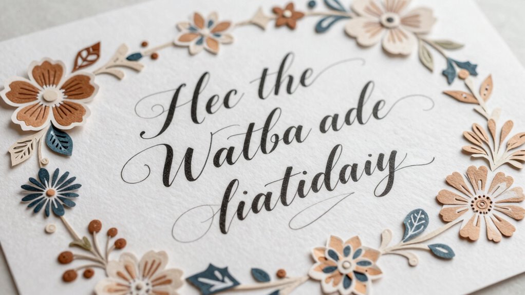

To balance typography and decoration in paper crafts, start by choosing a cohesive color palette that complements both elements. Use proper spacing and scale to prevent decoration from overpowering the text, and select materials that support your overall design. Keep clutter to a minimum, and focus on creating visual hierarchy so viewers can easily follow your message. When you prioritize harmony and purpose, your design becomes more engaging—if you keep exploring, you’ll discover how to perfect this balance.

Get business pricing on tools and workshop supplies
- Business-only prices and quantity discounts
- Tax-exempt purchasing
- Multiple users, one account, clear invoices
Key Takeaways
- Maintain visual hierarchy by making typography prominent and decorative elements supportive.
- Limit the number of colors and embellishments to prevent visual clutter.
- Choose materials and textures that complement both typography and decoration for harmony.
- Use balanced placement and spacing to create a cohesive flow across the design.
- Ensure decorative elements enhance rather than overpower the message, preserving clarity.

When creating paper crafts that feature both typography and decoration, striking the right balance is essential to guarantee your design remains visually appealing and effective. Your goal is to ensure that neither element overwhelms the other, allowing both to work together harmoniously. To achieve this, you need to pay close attention to color coordination and material selection, which are fundamental in guiding the viewer’s eye and establishing visual equilibrium.
Color coordination plays a crucial role in balancing typography and decoration. You want your colors to complement each other without clashing or competing for attention. Choose a cohesive palette that enhances your message and aesthetic. For example, if your typography is bold and vibrant, consider using softer, more subdued decorative elements. Conversely, if your decoration is intricate or colorful, opt for a simpler, monochromatic font. This contrast helps your message stand out while maintaining harmony throughout the design. Keep in mind that using too many colors can create visual chaos, so stick to a limited palette to streamline your composition and create a unified look. Additionally, understanding the concept of visual hierarchy can help you prioritize elements effectively, ensuring the most important aspects of your design draw the viewer’s attention first.
Use a limited, cohesive color palette to balance bold typography and intricate decoration for harmony.
Material selection is equally important. The types of paper and embellishments you choose can influence how your typography and decoration interact. Heavier, textured paper can add depth and sophistication, making your decorative elements pop without overshadowing your text. Thin or smooth paper works well for delicate typography, ensuring it remains readable and crisp. When incorporating embellishments like ribbons, stickers, or cutouts, select materials that complement your paper’s texture and color. For instance, metallic accents pair beautifully with minimalist fonts, adding a touch of elegance without cluttering the design. The right material choices can subtly steer the viewer’s focus toward the most important parts of your craft, helping you maintain balance. Moreover, considering the visual flow of your design can significantly influence how viewers navigate through your work, making certain elements more prominent and guiding the eye naturally across the composition. A well-considered composition ensures that every element has a purpose and contributes to the overall harmony.
Ultimately, balancing typography and decoration involves mindful consideration of how color and material interact. You want the decorative elements to support and enhance your message, not distract from it. By carefully selecting a harmonious color scheme and thoughtful materials, you create a composition where both the text and decorations coexist smoothly. This balance ensures your paper craft feels cohesive, professional, and visually compelling. Remember, the key lies in simplicity and intentional pairing—when you master these elements, your designs will seamlessly blend decorative flair with clear, impactful typography.
paper craft decorative embellishments
As an affiliate, we earn on qualifying purchases.
As an affiliate, we earn on qualifying purchases.
Frequently Asked Questions
How Do I Choose the Right Paper Type for My Project?
Choose your paper based on your project’s purpose, focusing on paper texture and weight selection. If you want a smooth surface for crisp typography, opt for a high-quality, smooth-textured paper. For more decorative elements, a textured paper adds visual interest. Heavier weight papers provide sturdiness for cards or 3D projects, while lighter ones suit intricate cuts or delicate designs. Always consider how the paper’s texture and weight complement your overall design.
What Software Can Help With Designing Paper Craft Typography?
Think of design software as your creative compass, guiding your typography inspiration and font pairing choices. Programs like Adobe Illustrator and Canva serve as your digital palette, offering tools to craft harmonious letterforms and vibrant decorations. They let you experiment freely, ensuring your paper craft’s typography complements its decorative elements. With these tools, you transform your ideas into visually mesmerizing creations that balance elegance with artistic flair.
How Can I Incorporate Personal or Custom Fonts Effectively?
You can incorporate personal or custom fonts effectively by applying handlettering techniques to create unique, personalized styles. Use font pairing strategies to combine your custom fonts with complementary typefaces, ensuring visual harmony. Experiment with different letterforms and embellishments, maintaining consistency in style and size. This approach allows your paper crafts to stand out while balancing decoration and typography seamlessly, making your projects truly distinctive and engaging.
What Are Some Quick Tips for Fixing Uneven Typography?
To fix uneven typography quickly, start by practicing calligraphy techniques to improve your control and consistency. Use a ruler or grid to align your text and guarantee even spacing. When font pairing, choose complementary fonts that balance each other visually, which can hide minor imperfections. Adjust your lettering size and spacing as needed, and take your time to review and refine your work, creating a polished, balanced look in your paper crafts.
How to Balance Color Schemes Between Text and Decorations?
To balance color schemes between text and decorations, you need to create harmony and contrast. Use color harmony by choosing colors that complement each other, making the design feel cohesive. Incorporate visual contrast by selecting bold or contrasting colors for decorations while keeping text in a more subdued tone. This approach highlights your message, draws attention to decorations, and maintains visual interest, ensuring your paper craft looks polished and balanced.
As an affiliate, we earn on qualifying purchases.
Conclusion
Just like a master painter balances colors on their palette, you’ll find harmony by thoughtfully blending typography and decoration. Remember the Bard’s words—“Brevity is the soul of wit”—and keep your design succinct yet impactful. When you strike the right balance, your paper craft becomes a poetic dance of visuals and words, capturing attention effortlessly. Trust your instincts, and your creations will sing just like a well-composed symphony—beautiful, balanced, and unforgettable.
metallic accents for paper crafts
As an affiliate, we earn on qualifying purchases.
As an affiliate, we earn on qualifying purchases.
color-coordinated paper craft supplies
As an affiliate, we earn on qualifying purchases.
As an affiliate, we earn on qualifying purchases.
Fall yard work Picks
leaf blowers
As an affiliate, we earn on qualifying purchases.