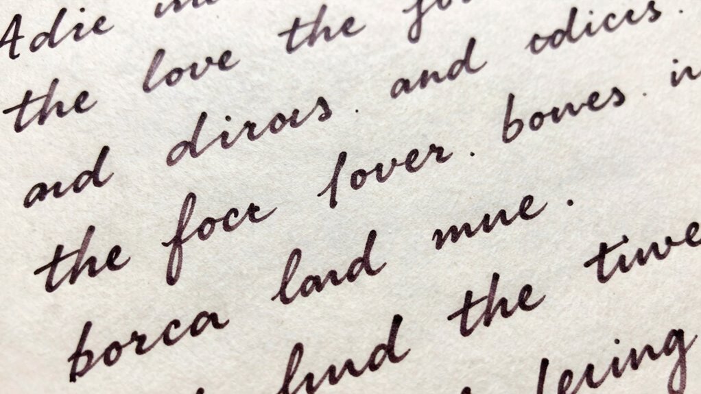

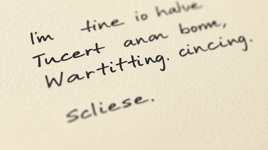
Uneven or off-looking handwriting often comes from inconsistent letter spacing. When your letters are too close or too far apart, it disrupts the visual flow, making your writing harder to read and appear less professional. Proper spacing, including fine-tuning kerning between letter pairs, helps create a balanced, cohesive look. Paying attention to your spacing can markedly improve your handwriting’s appearance—if you want to discover more tips, keep going.
Key Takeaways
- Inconsistent letter spacing can disrupt the visual flow, making handwriting appear uneven or unprofessional.
- Uneven or too tight/loose spacing between letters affects legibility and can make handwriting look “off.”
- Proper spacing ensures smooth eye movement across words, improving overall readability and aesthetic harmony.
- Lack of attention to kerning causes letters to clash or seem disconnected, impacting the handwriting’s appearance.
- Adjusting letter spacing thoughtfully can make handwriting look more polished, balanced, and visually appealing.
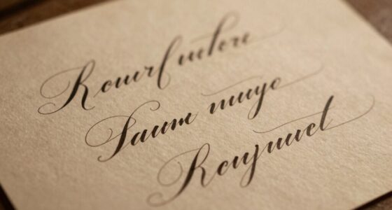
Have you ever wondered how the spacing between letters can influence the way text looks and feels? It’s more than just a matter of aesthetics; it affects readability, tone, and overall harmony. When your handwriting or font choices seem “off,” it’s often due to how the letters are spaced. Small adjustments, like kerning adjustments, can make a huge difference. Kerning refers to the process of fine-tuning the space between specific pairs of letters to guarantee they appear evenly spaced and visually balanced. Without proper kerning, even perfectly designed fonts can look awkward or unprofessional. You might notice that certain letter pairs, like “AV” or “To,” seem too close or too far apart, which can disrupt the flow of reading. By making kerning adjustments, you help the eye move smoothly across the text, creating a more polished appearance. Paying attention to letter spacing techniques can significantly impact the overall quality of your typography. Understanding font pairing techniques is also vital for achieving harmonious text layouts. When combining fonts, you need to take into account how their letter spacing interacts. Contrasting fonts with vastly different spacing can make your design look disjointed, while complementary pairings can create a cohesive, inviting look. For example, pairing a bold, wide font with a narrow, delicate one can work well if you pay attention to their spacing. You might need to tweak kerning adjustments within each font or across the pair to make sure they align perfectly in tone and readability. Proper font pairing techniques involve more than just matching styles; it’s about balancing space to guide the reader’s eye naturally from one element to the next. If you’re designing a logo, creating a website header, or simply trying to improve your handwriting, paying attention to letter spacing is key. You can manually adjust kerning in digital tools or focus on consistent letter spacing in handwriting. When done correctly, your text will feel more unified, professional, and visually appealing. Conversely, uneven or inconsistent spacing can make your writing appear sloppy or hard to read, even if your letter shapes are perfect. Practice and awareness of these subtle adjustments will help you develop a more intuitive sense of how space influences the overall look. Over time, you’ll notice how small tweaks in kerning and thoughtful font pairing can elevate your designs from average to exceptional.
handwriting letter spacing guide
As an affiliate, we earn on qualifying purchases.
As an affiliate, we earn on qualifying purchases.
Frequently Asked Questions
How Does Letter Spacing Affect Readability in Different Fonts?
Letter spacing considerably impacts readability across fonts. Proper kerning in typography ensures characters aren’t too close or too far apart, making text easier to read. When you choose font pairing strategies, consider how spacing complements different styles, avoiding clutter or confusion. Adjusting letter spacing helps maintain clarity, especially in smaller or decorative fonts, ensuring your message stays legible and visually appealing, regardless of font choice.
Can Adjusting Letter Spacing Improve My Handwriting Skills?
Adjusting letter spacing can definitely improve your handwriting skills, especially when you incorporate calligraphy techniques and consistent handwriting practice. By experimenting with spacing, you develop better control and rhythm, making your writing more legible and visually appealing. Focus on maintaining even gaps between letters as you practice, and you’ll see gradual improvement in your overall handwriting. Consistent adjustments help you develop a natural, balanced style over time.
What Tools Can Help Me Analyze Optimal Letter Spacing?
While it’s often said that tools are just guides, they can truly help you refine your craft. You can use software with kerning techniques and spacing guidelines to analyze your handwriting, revealing subtle inconsistencies. Digital apps, like handwriting analysis programs or even graphic design tools, allow you to experiment with spacing and find what feels most natural. These tools serve as gentle mentors, guiding you toward more balanced, harmonious handwriting.
Does Letter Spacing Influence the Emotional Tone of Writing?
Yes, letter spacing influences the emotional perception of your writing. When you use ideal letter spacing aesthetics, your message can feel more inviting, calm, or professional. Tight spacing might convey urgency or discomfort, while wider spacing suggests openness and friendliness. By adjusting letter spacing, you shape how readers interpret your tone, making your handwriting more emotionally resonant and visually appealing.
How Does Letter Spacing Vary Across Different Languages and Scripts?
Imagine you’re practicing calligraphy, and you notice that spacing varies between scripts. In Arabic, script traditions emphasize connected, flowing letters with minimal spacing, while Latin scripts often have more uniform gaps for clarity. Different languages influence letter spacing through calligraphy techniques and script traditions, shaping how writing appears. You adapt your style accordingly, respecting these cultural nuances to make your handwriting more authentic and visually appealing.
kerning adjustment pen
As an affiliate, we earn on qualifying purchases.
As an affiliate, we earn on qualifying purchases.
Conclusion
Understanding letter spacing helps your handwriting breathe and connect. When you master this subtle art, your words become more than just letters—they transform into a flow that guides the reader’s eye effortlessly. Think of spacing as the silent conductor of your written symphony; when it’s just right, everything falls into harmony. So, don’t overlook these tiny adjustments—they hold the power to turn chaos into clarity, making your handwriting truly resonate beyond the page.
font pairing and spacing tools
As an affiliate, we earn on qualifying purchases.
As an affiliate, we earn on qualifying purchases.
calligraphy practice sheets
As an affiliate, we earn on qualifying purchases.
As an affiliate, we earn on qualifying purchases.