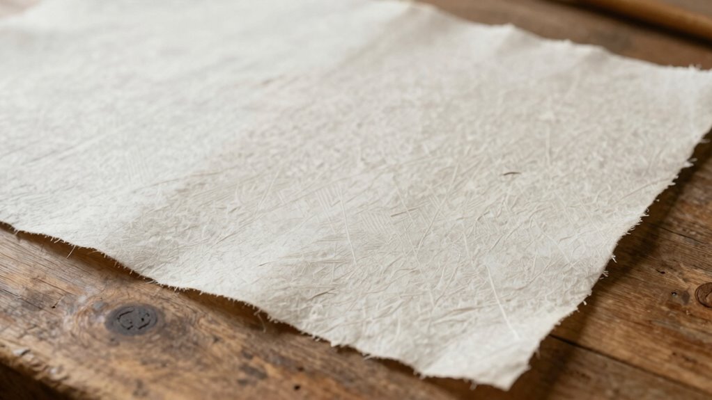

To improve your page layout for handmade paper goods, focus on choosing organic, handcrafted fonts that balance readability with artisanal charm. Use earthy, subdued color palettes and incorporate organic design elements to enhance visual harmony. Highlight the paper’s natural textures while leaving enough white space for balance. Prioritize contrast and balance across your layout to showcase the craftsmanship. Keep these tips in mind, and you’ll discover how to create layouts that truly highlight the beauty of handmade paper.

Get business pricing on tools and workshop supplies
- Business-only prices and quantity discounts
- Tax-exempt purchasing
- Multiple users, one account, clear invoices
Key Takeaways
- Use organic, handcrafted fonts with varied sizes and weights to create visual interest and complement the paper’s texture.
- Choose earthy, subdued color palettes to enhance the natural beauty and harmony of the layout.
- Incorporate organic design elements and tactile cues to reinforce the artisanal feel.
- Balance texture and visual elements with ample white space to highlight handcrafted qualities.
- Maintain consistency in typography, color, and layout to create a cohesive and memorable design.
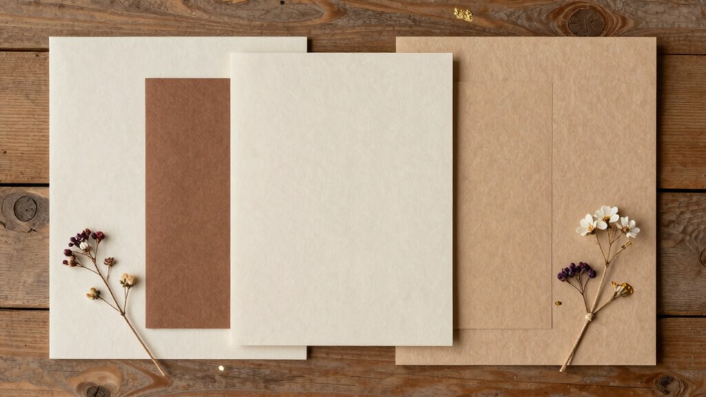
Creating beautiful handmade paper goods requires thoughtful page layout to showcase their unique textures and details effectively. When you’re working with handmade paper, every element on the page should serve a purpose, highlighting the natural beauty and tactile qualities of the material. One of the most significant aspects of this is making deliberate typography choices. You want your fonts to complement the handcrafted feel without overpowering the paper’s inherent charm. Opt for typefaces with organic, slightly irregular edges or handcrafted styles that echo the artisanal quality of your paper. Keep your typography clean and legible, but don’t shy away from experimenting with sizes and weights to create visual interest. Use larger, bolder fonts sparingly for headings or focal points, and consider softer, more delicate fonts for body text to maintain harmony between text and texture. Incorporating organic design elements can further enhance the cohesive, handcrafted aesthetic of your layout. Color schemes also play an essential role in enhancing your handmade paper goods. Since handmade paper often has natural variations, selecting a color palette that aligns with its earthy, organic feel can elevate your design. Stick to muted, warm tones like browns, creams, soft greens, or pastels that complement the subtle textures of the paper. Bright or highly saturated colors might clash with the handmade aesthetic, so instead, aim for subdued hues that allow the paper’s natural beauty to shine through. When choosing color schemes, think about contrast and harmony. Light-colored text on darker paper can create striking readability, but confirm the contrast isn’t too stark, which could detract from the organic look. Conversely, darker text on light paper often provides a clean, elegant appearance, allowing your message to stand out without overwhelming the tactile qualities. Balancing typography and color is essential for a cohesive page layout. For example, pairing a rustic font with a harmonious color palette can evoke warmth and authenticity. Use consistent color schemes throughout your project to establish visual flow, avoiding too many competing hues that can distract from the handmade appeal. Additionally, understanding the importance of contrast in layout design can help you make informed choices that enhance readability and aesthetic harmony. Paying attention to the tactile qualities of handmade paper can also inspire your overall design approach, ensuring that the visual elements complement the physical texture. Recognizing the role of texture can guide you in selecting elements that emphasize the paper’s natural feel. Being mindful of visual balance is crucial to prevent clutter and create a harmonious composition that highlights the artisanal qualities. When arranging elements, leave enough white space to prevent the layout from becoming cluttered, allowing each component—whether text or decorative details—to breathe and stand out. Remember, your goal isn’t just to make the page look good but to craft a design that enhances the handmade paper’s distinct textures and details. By thoughtfully selecting your typography choices and color schemes, you confirm your handmade paper goods are both beautiful and memorable, showcasing their artisanal quality in every carefully crafted detail.
handmade paper display layout tools
As an affiliate, we earn on qualifying purchases.
As an affiliate, we earn on qualifying purchases.
Frequently Asked Questions
How Do I Choose the Best Paper Thickness for My Layout?
Choose a paper thickness that balances your design’s text density and visual hierarchy. Thicker paper supports more substantial elements and prevents ink bleed, making your layout clearer. For dense text, opt for medium to heavyweight paper to enhance readability. Lighter paper works better for delicate, minimalist designs. Consider how the paper’s feel complements your overall style and purpose, ensuring your layout remains visually appealing and easy to navigate.
What Tools Are Essential for Precise Page Alignment?
You need a steel ruler and a T-square for precise page alignment, guaranteeing consistent margin spacing. Use a pencil for light markings and a quality eraser to maintain typography consistency. A clear, grid-lined cutting mat helps verify alignment, while a level or straightedge ensures edges are true. These tools help you achieve neat, professional layouts, making sure your handmade paper goods look polished and well-organized.
How Can I Incorporate Mixed Media Without Cluttering the Layout?
You can incorporate mixed media without cluttering your layout by using layering techniques to create depth and balance. Place lightweight elements like delicate papers or thin embellishments strategically, allowing textured contrast to highlight different materials. Keep some areas clean to avoid overwhelming the eye, and use subtle overlaps to unify your design. This approach maintains clarity while adding visual interest, ensuring your handmade paper goods look cohesive and thoughtfully crafted.
What Color Schemes Work Best for Handmade Paper Backgrounds?
Think of your color scheme as a dance where every hue must complement each other. For handmade paper backgrounds, stick to complementary hues and strong color contrast to make your design pop without overwhelming. Earthy tones paired with soft pastels create harmony, while bold contrasts add energy. Keep it balanced, and your layout will feel cohesive and inviting, like a well-choreographed performance on a stage of handmade textures.
How Do I Balance Text and Imagery Effectively?
You balance text and imagery by establishing a clear typography hierarchy, making sure headlines stand out while supporting text remains readable. Use visual flow to guide the viewer’s eye naturally across your page, placing images strategically near related text. Keep enough white space around both elements to prevent clutter. This approach helps create harmony, ensuring your handmade paper goods look cohesive and engaging without overwhelming the viewer.
organic handcrafted fonts for design
As an affiliate, we earn on qualifying purchases.
As an affiliate, we earn on qualifying purchases.
Conclusion
So, next time you think your handmade paper needs a little extra flair, remember—sometimes less is more. Ironically, overthinking your layout can turn your beautiful craft into a cluttered mess. Trust your instincts, keep it simple, and let your handmade touch shine through effortlessly. After all, the secret to a stunning page isn’t about perfection—it’s about showing your genuine, imperfect charm. Happy crafting!
earth tone color palettes for paper crafts
As an affiliate, we earn on qualifying purchases.
As an affiliate, we earn on qualifying purchases.
textured handmade paper for art projects
As an affiliate, we earn on qualifying purchases.
As an affiliate, we earn on qualifying purchases.
Halloween Picks
halloween
As an affiliate, we earn on qualifying purchases.