Patterns that always feel balanced use a thoughtful mix of color harmony and symmetry. When you choose complementary or analogous colors, you guide the eye smoothly and create a calming effect. Incorporating symmetry through mirroring or proportional placement enhances stability. These elements work together to tap into your subconscious, evoking feelings of order and satisfaction. If you keep exploring, you’ll discover how these core principles transform your own patterns into naturally balanced designs.

Get business pricing on tools and workshop supplies
- Business-only prices and quantity discounts
- Tax-exempt purchasing
- Multiple users, one account, clear invoices
Key Takeaways
- Harmonious color combinations, such as complementary or analogous palettes, create visual balance and calm.
- Symmetry, through mirroring or proportion, establishes stability and a sense of order in patterns.
- The alignment of color and symmetry guides the eye naturally, enhancing perceived harmony.
- Subtle variations in shades and tones deepen visual cohesion and reinforce balance.
- Recognizing the interplay of color harmony and symmetry reveals why patterns evoke feelings of satisfaction.
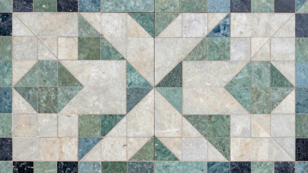
Have you ever noticed certain patterns in design, nature, or daily life that just feel inherently balanced? It’s like an unspoken harmony that resonates deep within you. When you look at a well-designed room, a blooming flower, or even a well-composed photograph, you might sense that something is just right—even if you can’t immediately identify what. That feeling often comes down to understanding the secret structure behind these patterns, which hinges on principles like color harmony and symmetry.
Color harmony plays an essential role in creating that balanced feeling. When colors are chosen thoughtfully, they work together to produce a sense of order and calm. You might notice that complementary colors—like blue and orange—appear striking yet balanced when paired correctly. Similarly, analogous colors—those next to each other on the color wheel—generate a soothing, cohesive look. This deliberate selection of hues guides your eye smoothly across a pattern, making it feel unified and stable. Even subtle variations in shades and tones can enhance this effect, reinforcing the overall harmony. When the colors seem to support each other rather than clash, your subconscious registers that as a balanced, pleasing arrangement. Recognizing how visual elements interact can deepen your understanding of balanced design. Additionally, understanding perception helps explain why certain patterns evoke feelings of harmony even without conscious awareness. This awareness of visual perception can help you identify what makes a pattern feel balanced at a subconscious level. Moreover, the way our brains process visual cues influences our perception of harmony and stability in patterns. Recognizing the role of cognitive processing can further illuminate why some patterns resonate with us more deeply than others.
Thoughtful color choices create harmony, guiding the eye and fostering a sense of calm and balance in any design.
Symmetry principles are equally essential in shaping patterns that feel inherently balanced. Symmetry involves mirroring or aligning elements so that one side reflects the other, creating a sense of stability. Think about the perfect symmetry of a butterfly’s wings or the balanced architecture of a classical building. You instinctively recognize that these arrangements are stable because they follow a predictable, mirrored pattern. Symmetry doesn’t always mean perfect mirroring; sometimes, it’s about visual balance through proportion and placement. When you see a pattern that repeats or mirrors itself across an axis, your brain perceives it as harmonious and complete. This natural tendency to seek symmetry is why balanced patterns often evoke feelings of calm and order.
Both color harmony and symmetry principles work together to craft patterns that feel naturally balanced. They guide your perception, leading your eye across a design in a way that feels effortless and satisfying. When these elements align, your subconscious registers a sense of order, stability, and beauty—without even realizing it. That’s the secret behind patterns that always seem perfectly balanced. Whether in art, nature, or everyday objects, these principles create a visual language that resonates with your innate sense of harmony. Recognizing these elements helps you understand why certain patterns evoke such a strong feeling of balance, and it empowers you to create your own designs with that same effortless appeal.
As an affiliate, we earn on qualifying purchases.
Frequently Asked Questions
How Do Cultural Differences Influence Perceptions of Balance?
Cultural differences shape how you perceive balance through cultural symbolism, which varies widely among societies. For example, some cultures see symmetry as harmony, while others value asymmetry for its uniqueness. These perception variations influence your aesthetic preferences and sense of equilibrium. You might find a pattern balanced based on your cultural background, but someone else may see it differently, highlighting how deeply perception is tied to cultural symbolism.
Can Natural Patterns Exhibit the Same Balance Principles?
Yes, natural patterns can exhibit the same balance principles. Your perception of symmetry, for example, is often aligned with how nature’s harmony manifests in patterns like leaves, seashells, or snowflakes. These natural designs follow mathematical rules and proportions, creating a sense of balance that feels instinctively right. By observing nature’s symmetry perception, you can better understand the universal principles that make these patterns feel inherently balanced and pleasing.
What Role Does Color Theory Play in Balanced Patterns?
Imagine a painter mixing colors to evoke feelings; that’s how color theory shapes balanced patterns. You use color harmony to create visual cohesion, guiding the viewer’s eye smoothly across the design. The emotional impact hinges on your color choices, as contrasting or complementary hues evoke different moods. By understanding these principles, you craft patterns that feel naturally balanced, resonating emotionally and making your work visually compelling.
How Do Digital Designs Incorporate These Balanced Structures?
Digital designs incorporate balanced structures using algorithmic symmetry, ensuring elements are precisely mirrored or repeated to create visual harmony. You can achieve this by applying algorithms that automatically generate symmetrical patterns or arrangements, making the design feel stable and pleasing. This process allows you to manipulate balance effortlessly, resulting in engaging visuals that resonate with viewers through consistent, harmonious structures. Algorithmic symmetry is key to maintaining visual harmony in digital compositions.
Are There Common Mistakes When Creating Balanced Patterns?
You might stumble into symmetry pitfalls or face asymmetry challenges when creating balanced patterns. Common mistakes include overusing symmetry, making the design too predictable, or neglecting visual weight, causing imbalance. Sometimes, designers overlook how subtle asymmetries can actually enhance harmony. The key is to strike a delicate balance—literally—by intentionally playing with symmetry and asymmetry, ensuring your pattern feels naturally balanced without falling into predictable pitfalls.
As an affiliate, we earn on qualifying purchases.
Conclusion
Now that you understand the secret structure behind balanced patterns, you see how symmetry, repetition, and focal points create harmony. It’s almost like having a modern touch of the Renaissance in your design choices—timeless, elegant, and precise. Remember, when you craft or analyze patterns, you’re not just creating beauty; you’re tapping into an ancient code that resonates with something deep within us all. Embrace this knowledge, and your work will always feel just right.
As an affiliate, we earn on qualifying purchases.
complementary color palette paint
As an affiliate, we earn on qualifying purchases.
As an affiliate, we earn on qualifying purchases.
Fall Picks
fall essentials
As an affiliate, we earn on qualifying purchases.