
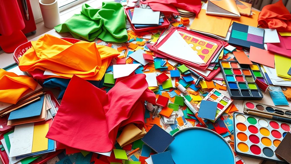
To avoid color clashes in your crafts, watch out for overusing clashing combinations like too many contrasting or similar shades, which can make your work look chaotic. Don’t ignore color harmony or balance—using too many bold colors without pairing them with neutrals or softer hues can overpower your design. Relying only on bright or bold colors risks visual overload. Learn how to create harmony and balance, and you’ll elevate your craft projects to the next level.
Key Takeaways
- Overusing clashing complementary colors creates visual chaos and diminishes design harmony.
- Ignoring color harmony and balance results in disorganized, dull, or conflicting color schemes.
- Relying solely on bold or bright colors can overwhelm the design and reduce visual cohesion.
- Mixing too many contrasting or similar colors without moderation causes clutter and distracts focus.
- Incorporating neutral tones and understanding color relationships enhances visual balance and prevents clashes.
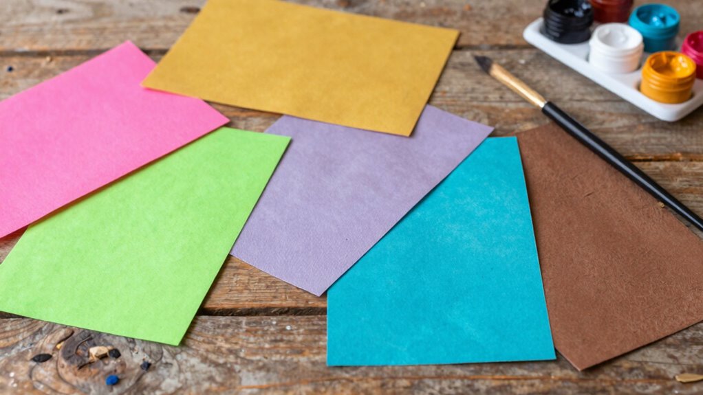
Overusing Clashing Color Combinations
While bold color choices can make your projects stand out, overusing clashing color combinations often creates visual chaos rather than harmony. Complementary pairing, which uses opposite colors on the color wheel, can be striking but becomes overwhelming if overdone. Similarly, sticking solely to monochromatic schemes might seem simple, but layering too many shades without variation can flatten your design. When you mix too many contrasting or overly similar colors, your work loses focus and appears cluttered. To avoid this, balance bold choices with neutral tones or use subtle variations within schemes. Understanding when to limit your palette helps your craft projects look intentional and cohesive, rather than chaotic and confusing. Recognizing color harmony principles is essential for creating visually pleasing compositions. Incorporating visual balance into your color choices ensures your work remains visually appealing and easy to appreciate. Additionally, applying quality assurance practices can help ensure your color schemes achieve the desired aesthetic without unintended clashes. Being mindful of color contrast can also prevent your designs from becoming visually jarring and maintain overall harmony. Using color theory can further enhance your ability to select harmonious combinations that support your project’s overall aesthetic.
Ignoring Color Harmony and Balance

Ignoring color harmony and balance can quickly make your craft projects look disorganized and unappealing. Without considering how colors work together, your work may seem chaotic or dull. For example, relying solely on monochromatic schemes can lack contrast, making your project appear flat. Conversely, ignoring complementary contrasts can cause colors to clash painfully. To avoid this, pay attention to how colors interact. Utilizing color schemes effectively can help you create visually pleasing compositions. Additionally, understanding color relationships can guide you in selecting harmonious combinations. – Use monochromatic schemes for subtle, cohesive designs – Incorporate complementary contrasts to create visual interest – Balance bold and muted colors to prevent overwhelming viewers – Make sure color proportions support harmony – Step back and assess if the colors feel unified or chaotic
Ignoring color harmony and balance makes craft projects look chaotic and dull.
Mastering harmony and balance helps your craft projects look intentional and pleasing, rather than haphazard.
Relying Solely on Bright or Bold Colors

Relying solely on bright or bold colors can make your craft projects feel overwhelming and less sophisticated. Bright colors evoke strong emotions through color psychology, but overusing them can create chaos rather than harmony. Additionally, understanding color symbolism helps you communicate specific messages; for instance, red symbolizes passion, but too much can feel aggressive. To visualize this, imagine:
| Bright Red | Calm Blue | Soft Green |
|---|---|---|
| Excitement | Trust | Growth |
| Aggression | Serenity | Renewal |
Mixing bold colors without balance risks clashing visually and emotionally. Instead, incorporate softer hues or muted tones to provide contrast, allowing the bold colors to stand out without overwhelming your design. Balance and mindful color choices ensure your craft remains engaging and meaningful. Being aware of color temperature adjustments can further enhance the harmony of your color palette.
Frequently Asked Questions
How Can I Fix a Project With Too Many Clashing Colors?
To fix a project with too many clashing colors, start by consulting the color wheel and identify which colors are fighting each other. Use complementary schemes—colors opposite each other on the wheel—to create harmony. Simplify your palette by removing or toning down some colors, and add neutral shades like beige or white to balance. This approach helps your project look cohesive and visually appealing.
What Are Subtle Ways to Introduce Color Harmony?
You can introduce color harmony subtly through thoughtful color pairing and shade blending. Start by choosing colors that are next to each other on the color wheel, creating a natural flow. Then, blend shades gradually to soften progressions. Use small accents or accessories in harmonious hues to tie your project together without overwhelming it. These techniques help achieve a cohesive look while maintaining visual interest.
Can Neutral Tones Work With Bright Colors Effectively?
Neutral tones can absolutely work with bright colors, creating a stunning visual balance that’s more striking than a fireworks display! You’ll find that neutral shades like beige, gray, or white serve as a perfect backdrop, allowing your bright colors to pop without overwhelming. When combined thoughtfully, neutral tones anchor your design, making bright colors stand out beautifully and ensuring your craft project looks balanced, vibrant, and eye-catching.
How Do I Balance Multiple Bold Colors Without Overwhelming?
To balance multiple bold colors without overwhelming, focus on managing color contrast and visual weight. Use one dominant bold color and pair it with subtler shades to create harmony. Incorporate neutral tones to break up the brightness and give the eye a rest. Distribute colors evenly across your project, and consider their placement to maintain a balanced composition. This approach keeps your design vibrant yet cohesive.
Are There Tools to Help Choose Compatible Color Palettes?
Think of a color wheel as your trusty map for color matching. Yes, there are tools like digital palette generators and apps that help you choose compatible color palettes effortlessly. These tools guide you through selecting harmonious combinations, ensuring your craft projects don’t clash. By using a color wheel, you can visualize complementary, analogous, or triadic schemes, making color matching intuitive and stress-free.
Conclusion
Remember, avoiding these common mistakes can turn your projects from chaotic to enthralling. Sometimes, the most unexpected color pairings or overlooked harmony can spark creativity rather than clash. So, trust your instincts, but also take a moment to step back and see if your colors are working in harmony. After all, even the tiniest shift can make your craft truly shine—proving that a little awareness goes a long way in making your colors work perfectly together.