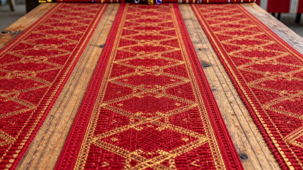

To use repetition without making your design boring, balance consistency with subtle variation. Repeat key elements like shapes or colors to create unity, but vary their size, spacing, or shades to keep interest alive. Breaking patterns occasionally and adding contrasting details also prevent predictability. Incorporate visual rhythm and harmony, and introduce small changes to refresh the viewer’s eye. Keep exploring these techniques further to craft engaging, memorable designs that hold attention seamlessly.

Get business pricing on tools and workshop supplies
- Business-only prices and quantity discounts
- Tax-exempt purchasing
- Multiple users, one account, clear invoices
Key Takeaways
- Incorporate subtle variations in size, color, or shape to maintain interest within repeated elements.
- Break repetitive patterns periodically with contrasting or unique elements for visual rests.
- Use a harmonious color palette with slight shades or tones to add depth and prevent predictability.
- Balance repetition with strategic contrast to highlight focal points and create dynamic flow.
- Vary the rhythm by adjusting the frequency and placement of repeated elements to keep the viewer engaged.

Have you ever noticed how repeating a key phrase or idea can make a message more memorable? That’s the power of repetition. When used thoughtfully, it can reinforce your message and create a cohesive, engaging design. But the challenge lies in avoiding boredom. If you overdo it or use repetition without variation, your work can become monotonous. The importance is to strike a balance, leveraging concepts like color harmony and visual rhythm to keep your audience interested.
Repetition doesn’t mean copying the same element over and over without change. Instead, it’s about creating patterns that guide the eye naturally, establishing a visual rhythm that makes your design flow smoothly. Think of visual rhythm as a heartbeat—steady, predictable, yet lively enough to keep things moving. When you incorporate repetition with variation, you add interest without losing coherence. For example, repeat a shape or motif but change its size or color slightly. This approach keeps your design lively and prevents it from feeling static or dull.
Repetition guides the eye with variations, creating a lively, flowing visual rhythm that maintains coherence and interest.
Color harmony plays an essential role in maintaining visual interest. When you repeat colors thoughtfully, you create a sense of unity that ties different elements together. However, using the same color too often can make your design predictable. To avoid this, introduce variations within a harmonious palette. Use different shades, tints, or tones that complement each other, adding depth and complexity. This subtle variation keeps the viewer engaged and prevents the repetition from becoming tiresome. It’s like a melody that repeats but with slight ornamentation—familiar yet fresh. Additionally, understanding the importance of visual rhythm can help you craft more dynamic and engaging designs. Developing a sense of color harmony can further elevate your work by creating a pleasing visual flow. Recognizing how repetition interacts with these elements is crucial for creating captivating visuals. Incorporating contrast strategically can also enhance the overall impact and prevent patterns from becoming monotonous. Furthermore, being aware of design principles such as balance and emphasis can help you fine-tune your patterns for maximum effect.
To keep repetition from becoming boring, consider breaking the pattern periodically. This doesn’t mean abandoning your theme but introducing a contrasting element or a different shape or color. This brief deviation creates a pause, a visual rest that re-engages the viewer’s attention. It also emphasizes the repeated elements when they reappear, making the pattern more impactful.
Ultimately, effective use of repetition relies on your ability to balance consistency with variation. By paying attention to color harmony and designing with a sense of visual rhythm, you guarantee your work remains engaging. You guide the viewer’s eye smoothly across your design, reinforcing your message without overwhelming or boring them. When done well, repetition becomes a powerful tool that enhances your message’s clarity and aesthetic appeal, making your design memorable and compelling.
Frequently Asked Questions
How Does Repetition Influence Viewer Engagement?
Repetition boosts viewer engagement by creating visual rhythm, guiding your eyes smoothly across the design. It establishes familiarity and keeps your attention focused, making the experience more memorable. When used thoughtfully, repetition enhances emotional impact, evoking feelings and reinforcing your message. It balances consistency with variation, ensuring your design remains lively without becoming monotonous. Ultimately, repetition helps you connect deeper with your audience by making your visuals more compelling and cohesive.
Can Repetition Create Confusion in Design?
Repetition can create confusion if it overwhelms or clashes with the overall design. To prevent this, you should use pattern disruption strategically, breaking repetition to draw attention or clarify. Maintaining a clear visual hierarchy ensures your message stands out. When used thoughtfully, repetition guides the viewer through your design smoothly, but if overdone or inconsistent, it can lead to confusion. Balance and intentional pattern disruption are key.
What Are Common Mistakes to Avoid With Repetition?
A common mistake is overusing repetition, which can harm color harmony and disrupt visual hierarchy. Did you know that inconsistent repetition makes viewers feel disoriented? To prevent this, diversify your elements subtly, maintaining a cohesive theme. Focus on strategic repetition to reinforce key ideas without overwhelming. Remember, balancing variety with repetition ensures your design remains engaging, clear, and visually harmonious, guiding viewers seamlessly through your message.
How Do You Balance Repetition With Variety?
You balance repetition with variety by maintaining pattern consistency while introducing subtle changes. Use consistent colors, shapes, or textures to create visual harmony, but vary their placement or scale to keep the design engaging. This approach guarantees your design feels cohesive yet dynamic, preventing boredom. By carefully blending uniformity with strategic variation, you create a rhythm that guides the viewer’s eye smoothly across your work.
Is Repetition Effective Across All Types of Media?
Repetition is effective across all media if you’re careful. It creates visual consistency and reinforces brand identity, making your message memorable. Whether in print, digital, or video, consistent use of color schemes, fonts, or motifs helps your audience recognize and connect with your brand. But don’t overdo it—if you beat a dead horse, your content becomes dull. Balance and strategic repetition keep your media engaging and memorable.
Conclusion
By mastering repetition, you paint a pattern that’s both familiar and exciting, like a heartbeat echoing through a quiet room. It’s the steady drum of a song, yet when you break the rhythm, it surprises like a sudden gust of wind. Use repetition wisely, and your design becomes a dance—predictable yet unpredictable, calm yet energetic. In this balance, your work stays engaging, avoiding boredom and inviting viewers to explore each carefully crafted detail.
Fall yard work Picks
leaf blowers
As an affiliate, we earn on qualifying purchases.