
To make your handmade color palettes feel richer and more mature, focus on selecting muted, complex hues that convey depth. Incorporate subtle hue variations and pair warm shades with cool neutrals for balance. Enhance the sophistication by adding textured effects like brushstrokes or matte finishes, and layer colors thoughtfully for natural harmony. Combining intentional color choices with tactile finishes creates a refined look. Keep going to discover more tips on elevating your palette with depth and nuance.

Get business pricing on tools and workshop supplies
- Business-only prices and quantity discounts
- Tax-exempt purchasing
- Multiple users, one account, clear invoices
Key Takeaways
- Incorporate muted, earthy tones and subtle hue variations to evoke depth and sophistication.
- Use analogous color schemes for harmonious, refined palettes that avoid overly bright or primary colors.
- Enhance textures with brushstrokes, matte finishes, or layered effects to create tactile richness.
- Blend colors gradually and incorporate gradients for subtle transitions and visual complexity.
- Focus on balanced color interactions that prioritize harmony, depth, and a mature aesthetic.
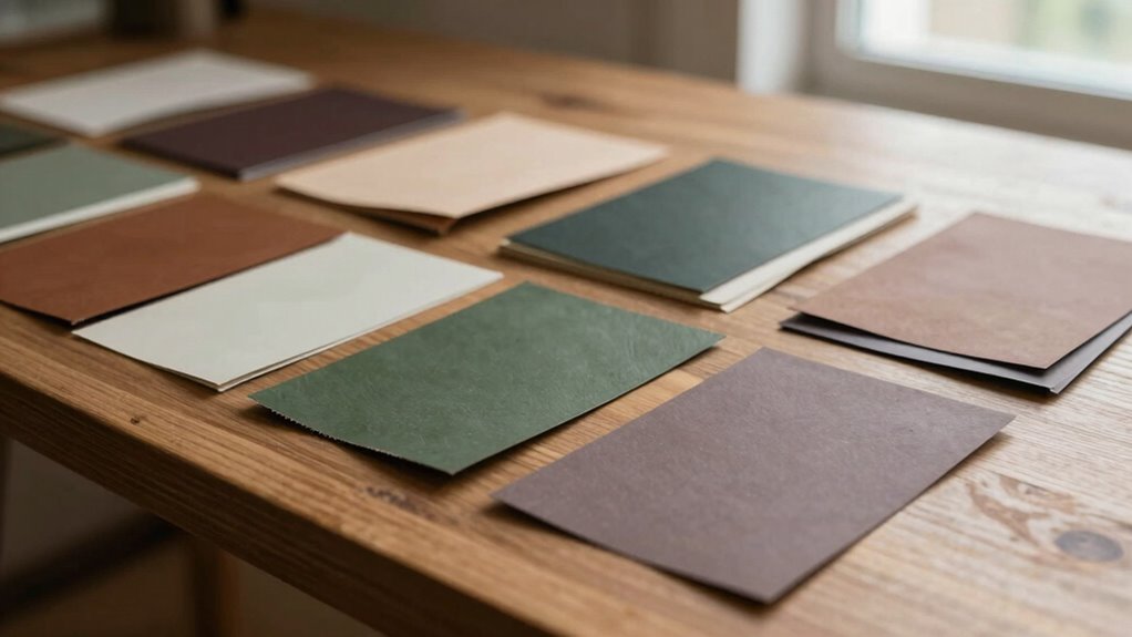
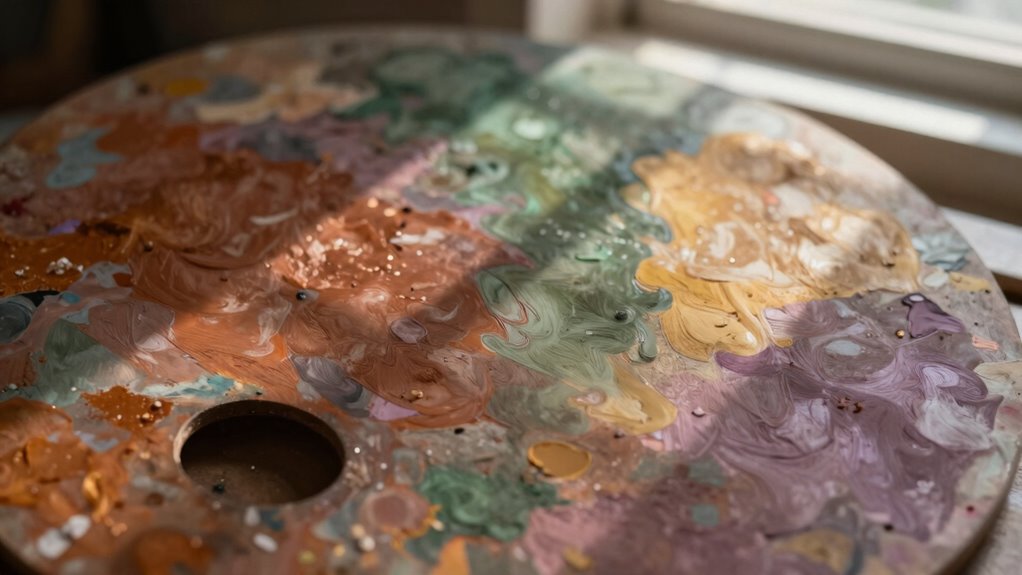
Creating handmade color palettes that feel richer and more mature might seem challenging, but with a few strategic choices, you can elevate your designs effortlessly. One of the most effective ways to do this is by applying solid principles of color theory. Instead of relying solely on bright or overly saturated hues, focus on selecting colors that have a natural depth and complexity. Muted tones, earthy shades, and subtle variations in hue can add a sense of sophistication. Use color theory to understand how different colors interact—pair warm shades with cool neutrals to create balance, or combine analogous colors for harmony. This approach guarantees your palette feels intentional and refined, steering away from the playful or juvenile look often associated with bright, primary colors.
Beyond choosing the right colors, texture enhancement plays a vital role in adding richness and maturity to your palette. When you incorporate texture into your work—whether through brushstrokes, paper surface, or digital effects—you introduce visual interest that makes the colors feel more layered and complex. Texture can simulate the tactile quality of traditional mediums, giving your palette a tangible, almost three-dimensional feel. This technique works especially well in handmade projects, where the physicality of the materials amplifies the sense of depth. For instance, adding a grainy or matte finish to your colors can make them appear more subdued and sophisticated, as opposed to shiny or glossy surfaces that tend to feel more youthful or commercial. Incorporating texture techniques can further enhance the richness and maturity of your palette. Another way to enhance texture is by blending or overlaying colors gradually, creating subtle shifts and gradients. This technique not only enriches the visual depth but also emphasizes the mature quality of your palette. When you layer colors thoughtfully, you avoid harsh contrasts, allowing the hues to mingle naturally. This harmony contributes to a more refined aesthetic. Remember, the goal is to craft a palette that feels both deliberate and nuanced, avoiding overly stark or flat color combinations. Using texture to complement your color choices will help you achieve a more sophisticated, mature look.
muted color palette acrylic paints
As an affiliate, we earn on qualifying purchases.
As an affiliate, we earn on qualifying purchases.
Frequently Asked Questions
Can Incorporating Metallics Enhance the Richness of Handmade Palettes?
Yes, incorporating metallic accents can definitely enhance the richness of your handmade palettes. Metallics add a touch of sophistication and depth, making colors appear more vibrant and saturated. By selectively using metallic accents, you create contrast and intrigue, elevating the overall maturity of your palette. This subtle shimmer draws the eye, emphasizing color saturation and giving your handmade design a more luxurious, refined feel.
How Do Color Psychology Principles Influence Palette Maturity?
Color psychology shapes palette maturity by tapping into subconscious feelings, like a secret language only your colors can speak. You understand that color symbolism influences emotional resonance, making your palette feel more refined and intentional. When you choose colors wisely, they evoke sophistication and depth, transforming simple hues into a story that resonates emotionally, giving your handmade palette a richer, more mature vibe.
What Role Does Texture Play in Making Palettes Feel More Sophisticated?
Texture plays a vital role in elevating palettes to a more sophisticated level by adding depth and interest. You can achieve this through layered techniques, combining matte, gloss, or metallic finishes, which create tactile diversity. Incorporate tactile finishes like embossing or textured paints to enhance the sensory experience. These elements make your palette feel richer and more mature, inviting viewers to engage more deeply with your color story.
Are Neutral Tones Essential for Achieving a Mature Palette?
Neutral tones aren’t strictly essential, but they considerably help create a mature palette. Incorporate neutral colors like beige, gray, or taupe to establish a calm, sophisticated foundation. Use subtle contrasts with richer hues to add depth without overwhelming the senses. This balance keeps your palette feeling refined and versatile, making your handmade designs look more polished and mature. neutrals serve as an anchor, allowing the other colors to shine subtly.
How Can I Balance Bold and Subtle Colors for a Refined Look?
You can masterfully balance bold and subtle colors by embracing dynamic contrast, where striking hues are softened with muted tones, creating visual interest without overwhelming. Focus on color harmony by selecting shades that complement each other, ensuring your palette feels cohesive and refined. This interplay allows bold statements to shine while subtle hues provide a sophisticated foundation, resulting in a polished, mature look that’s both vibrant and nuanced.
As an affiliate, we earn on qualifying purchases.
Conclusion
By layering subtle shades and embracing earthy tones, you’ll transform your handmade palettes into a tapestry of depth and sophistication. Imagine the gentle fade of sunset hues melting into twilight, each color whispering stories of maturity and richness. When you infuse your work with these nuanced choices, your palettes become more than just colors—they become a visual symphony, inviting viewers to linger, explore, and feel the quiet elegance that only time and thought can evoke.
As an affiliate, we earn on qualifying purchases.
As an affiliate, we earn on qualifying purchases.
Fall Picks
fall essentials
As an affiliate, we earn on qualifying purchases.